
If you work in enterprise software, you're familiar with all the tricky parts of the UX workflow that demand your best efforts. As a knowledge worker navigating complex and creative environments, you need a range of ways to communicate your ideas and collaborate effectively with your team. Having reference points that are as instructive as possible is crucial for productive design conversations.
So if you're looking for a more streamlined approach to your work, or if you're finding it difficult to articulate your ideas, flow diagrams might be just the thing.
In this article, we’ll share the techniques we’ve used in enterprise software development that have helped us either express our ideas or get aligned on logic.
So let’s dive in—it’s time to rediscover the power of visual representation in making sense of intricate systems.
First, a definition: Flow diagrams are a simple way of externalizing your ideas and establishing a common understanding of things. When you want to explain complicated stuff, it’s much more efficient to create a flow diagram than to talk in circles for 20 minutes—and it’s easier for your team to understand your flowcharts.
Creating flow diagrams is a skill and habit that will allow you to better collaborate with others and create solutions that are better than anything you could have created on your own. It’s what we call design magic ✨ Plus, it’ll also help you develop and solidify your own thinking as you create things.
Flow diagrams can depict both the current state of affairs, and what’s possible for the future.
They streamline complex processes for collaborative teams by capturing different types of complexity in a visual way, including:
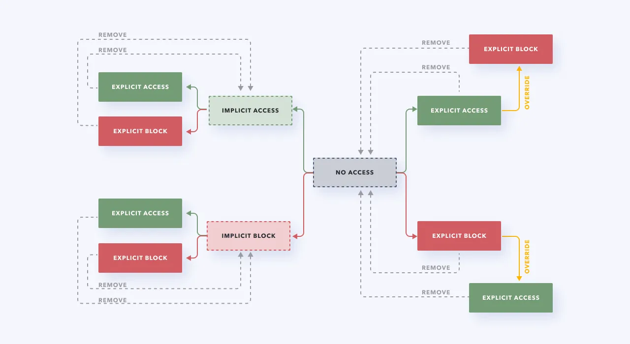
1) Logic that’s in the backend, like Boolean logic.
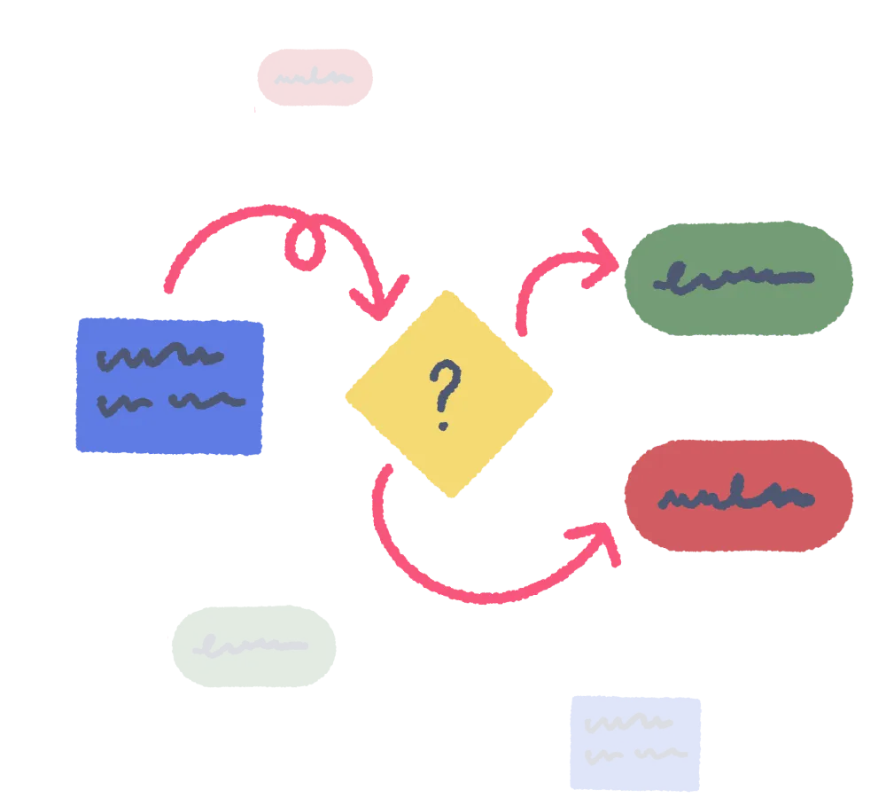
2) Flows (or movement) from one place to another by the user. The flow can either be conceptual (like mapping out your thought process on the type of car to buy) or more literal (mapping out each step it takes to drive to the car dealership and try a new car).
3) Context, meaning any relevant surrounding information that you might need to know to proceed.
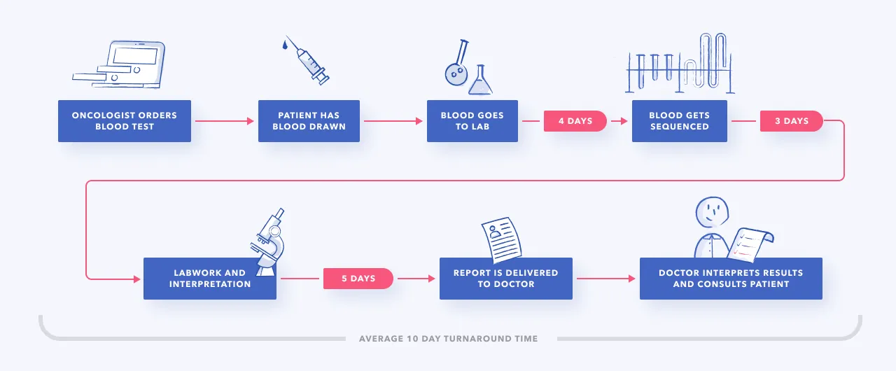
The good news: if you can draw a box and an arrow, then you can create flow diagrams. 🎉 Anyone can do it. So it’s time to start externalizing that brain of yours with flows of all kinds.
These are the types of flow diagrams you can use in your practice. Depending on a project's context and what you’re trying to achieve, flow diagrams can be working docs that evolve throughout the UX design process, or serve as final documentation.
✅ Arrows/direction and structure
🚫 Edge cases and complexity
First up, we have straightforward task flows, which depict tasks at different zoom levels. They help you understand how something gets accomplished in a product or website.
For example, here’s a login task flow, showing the flow of how the user advances from one step into the end state.

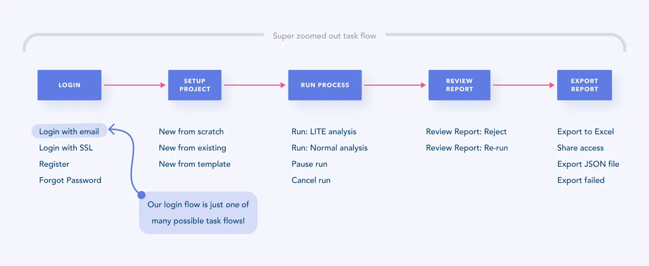
But task flows can also be less specific. You can use a more zoomed-out version of a task flow to depict movement throughout the entire product and get an overview. For example, here’s a task flow for the major phases, with other relevant task flows listed below. In this case, login with email is just one task flow within the product’s greater context.
✅ Arrows/direction
✅ Structure
✅ Logic
Next, we get into more details with user flows. Now, we know it sounds similar to task flows, but there are some big differences between these two types of diagrams. User flows involve structure and logic, where you layer decision points and complexity into the mix. They help you understand the nuances around how a task gets done, including the logic of where things get weird or complicated.
Taking a relatable real-life example (for all you gooey marshmallow fans), here’s a user flow for making s’mores. 🍫 Shout-out to Erika Hirano for the inspiration, who used pancakes as an example.

User flows give you a better idea of the different things that can happen throughout a process. As you can imagine, things can get pretty complicated and unruly with user flows, where the varying outcomes might seem endless. As you work on these, keep in mind that part of your job is to identify moments where your user flow has reached the point of no longer being understandable. That’s when you’ll separate it and re-architect things to simplify things.
✅ Structure
🚫 Arrows/direction
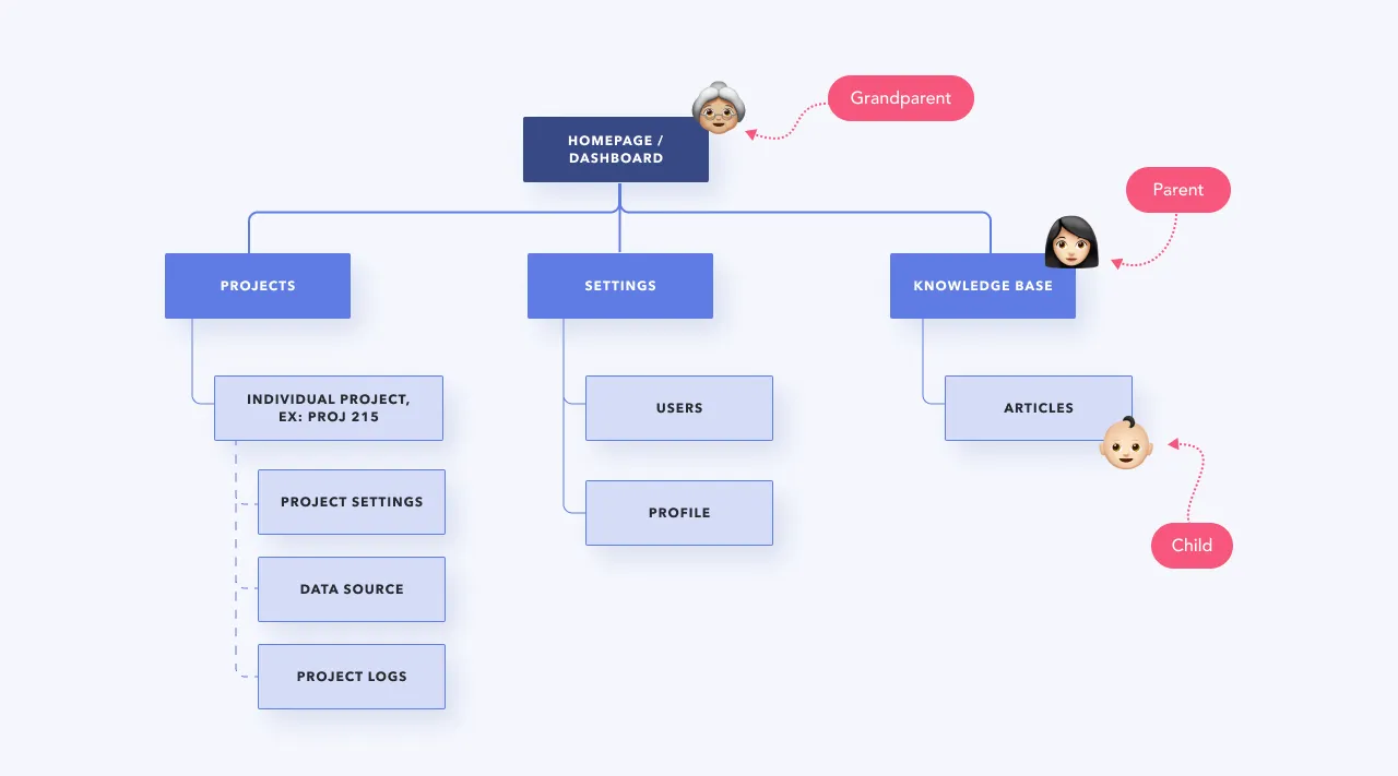
Lastly, tree diagrams are a representation of hierarchical relationships. Think of them as family trees for software products. 👨👩👧👦
Even though tree diagrams don’t strictly move in a direction like the previous two types of flow diagrams, they’re essential for understanding data architectures and navigation. They give you an overview of all places within a product or website.
There are a lot of flowchart tools out there, like Whimsical, Miro, Lucidchart, and Canva (we’re Whimsical fans at P&P), but you don’t want to create a separate log-in just for yourself. Collaboration is much easier with a shared tool.
Naming things holds a lot of power. Give context to your flow diagrams by adding titles, labels, and descriptions.
Explain to other people how to navigate your flowchart. You can record a Loom video message, leave a voice note, or write a description, telling them what they should know, and how you want them to interact with it. The worst thing you can do is send a random link to your flowchart, saying “Hey…thoughts?” That’s not great async collaboration—you want to give context and direction.
Flow diagrams are important artifacts, and should be treated as such. When they get unruly, separate them into smaller chunks. Getting into the habit of taking care of these diagrams when needed allows them to have a bigger impact.
Leave a papertrail of the “whys” behind your ideas to capture richer context. Clarifying as you go helps you remember why you did things and express to other people what you’re thinking. Sometimes that’ll spawn other ideas and your team can collectively figure out where the logic no longer works.
Reinforce your meaning with visual embellishments. Adding an icon here and there adds some visual relief (and makes things less boring 🥱), highlights landmarks, and improves communication. Especially as your flows get bigger, visual embellishments make them easier to navigate.
You can use flow diagrams to convey a range of ideas—from everyday tasks to intricate software processes. But that might leave you wondering just when and how exactly to use them. 🤷🏻♀️
Do a mini UX audit on your table views & find your trouble spots with this free guide.

Be the first to know about our upcoming release!


