Design Rationale Documentation
August 27, 2024

Ceara Crawshaw

Why did you decide to do what you did on your most recent round of wireframes? Do you stand by your decisions (and feel the logic and choices are solid), or are they mere guesses or shots in the dark (just to get something down to discuss further)? Can your stakeholders and collaborators see your thought process and quickly parse where your team is at with a particular design? Do you have a consistent way to remember and test your own logic as you navigate your way through the confusing and detailed process of designing complex software or features? To address these situations, you need to reassess your relationship with expressing and documenting your design rationale.
Now, before proceeding, we need to appreciate that some design rationale is very designer-y, whereas other decisions are a blend of different kinds of logic coming together. Say you’ve chosen fuschia for the button because it’s a vibrant colour in the brand palette and it's used everywhere in the product to indicate interactivity (very designer-y). But you’ve chosen an “Excel-like” edit interaction because the product strategy aims to compete directly with Excel, and users are very familiar with that interaction style (blending design and strategy). Or better yet, you’ve decided on “Layout 2” for your user management screen because it’s available with the front-end framework, seems intuitive and isn’t a very high-priority feature that warrants a big redo (blending design and development/feasibility logic).
Keep in mind that all that you do is in the context of working with your product team: This often includes a product manager, the dev crew and maybe a subject matter expert or two. As a tight knit collaborative group, your thinking gets more and more sophisticated as you “work the problem” together.
To manage the dynamic changes and evolution of the thinking of the group, you need a process to keep yourself and everyone else organized.
Documenting design rationale will help you:
Enter expressing design rationale as part of your everyday life ;) (welcome to your new lifestyle!)
Design rationale comes in at a few different “zoom levels”, whether it’s granular, like the reasoning around the fields in a form, or overarching around the goals of a design system or new feature.
It’s important to appreciate that expressing design rationale happens in a couple of different ways:
Here, we’re specifying that written is the primary way to express design rationale because when you write out what you’re thinking, you’re expressing it externally in a way that others can easily parse at a later time. Writing is a foundational part of the design practice, as much as it might not initially seem that way.
You’re working for a clinical diagnostics company. They make medical tests that patients can access through a free publically funded program. This is new tech, so adoption is taking time. Not that many doctors know about this test and what it can do yet.
Your team is replacing the analog process the company already has where the doctor prints off a test requisition form and physically gives it to their patient to take with them to a testing centre, which then gets sent to a lab. The lab will fax results to doctors, but the turnaround time and logistics are not transparent.
To build a solution that’s digital so that all the parties will be served better, with less wasted time on fax and phone call follow-ups.
Your team does interviews with doctors and other involved healthcare professionals (HCPs) and starts building out the concept in wireframes.
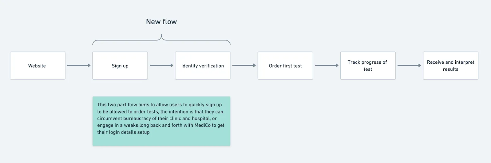
Within this relatively simple overarching flow, your team is proposing a new concept and flow which changes the operational model for adding new doctors to the system. Currently, telephone calls limit the amount of new doctors that could be added to the system. See how this defines rationale at the flow level? You can see the thinking behind this idea factors in the users themselves and what the business needs.
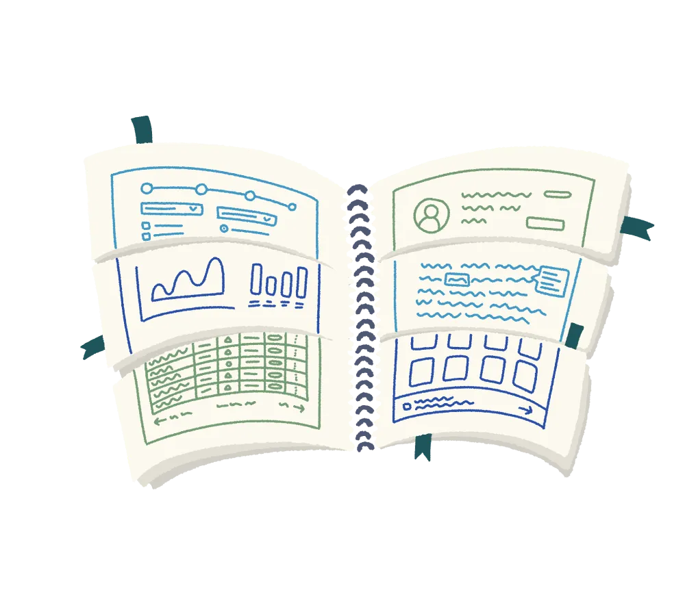
Once the user logs in and initially lands on the home page of the portal, this is a wireframe of what they see:
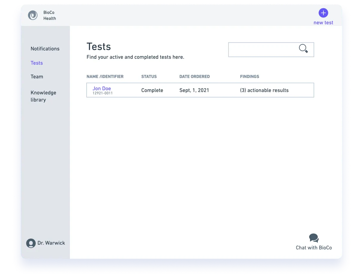
In our example, we have some pretty basic elements. Each of them is chosen and put there for a reason. Not everything is worth labelling and dissecting in a design process, but we emphasized a few decisions that were made and how the rationale is justifying them.
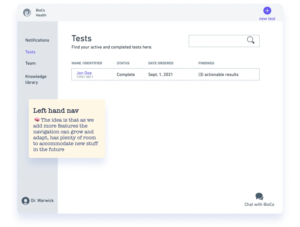
Left hand navigation: This is chosen to allow the navigation to grow in the future. This rationale isn’t terribly complex, but you can see that the designer thought about what they were doing as they executed it.
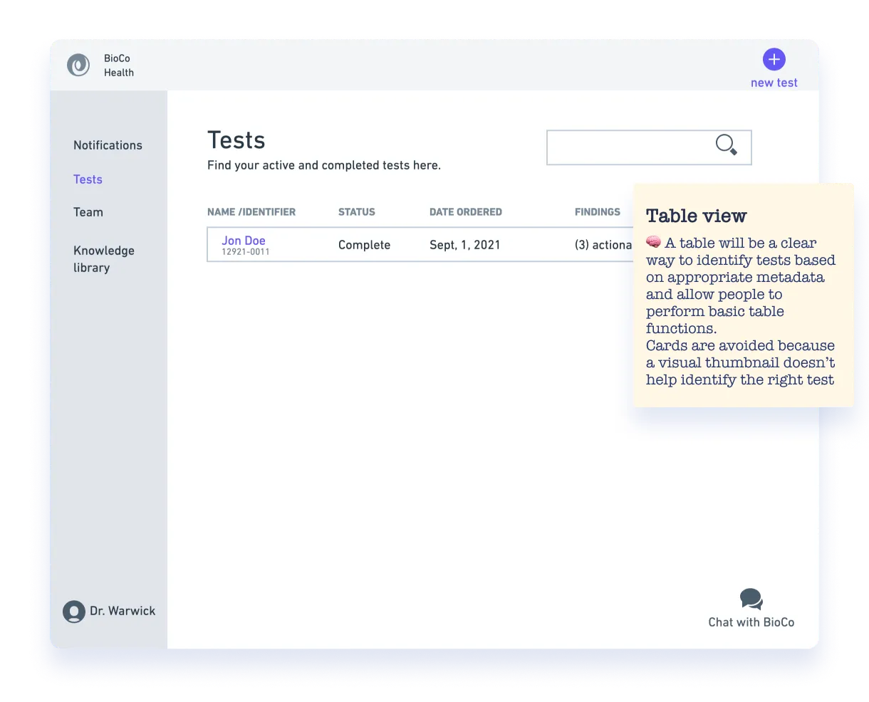
Tests data table: This is chosen to aid ease of use and familiarity. Many different layout options can be presented in an interface for items like this. Cards were dismissed in this specific case because having a more visual representation of information wouldn’t necessarily be a value-add. It’s important to note here that we’re trying to show solid thinking around these topics, not a mathematical proof that no one can argue with or that can’t be overturned. Design rationale is not a court ruling or a decree from the design gods ;). It’s also worth noting that you have to be wise about what needs to be documented and how strongly you stand behind the choice. In this case, it would be understandable to skip over the layout issue of the table vs cards and instead draw the attention to the columns which will be represented and/or the level of table functionality you expect.
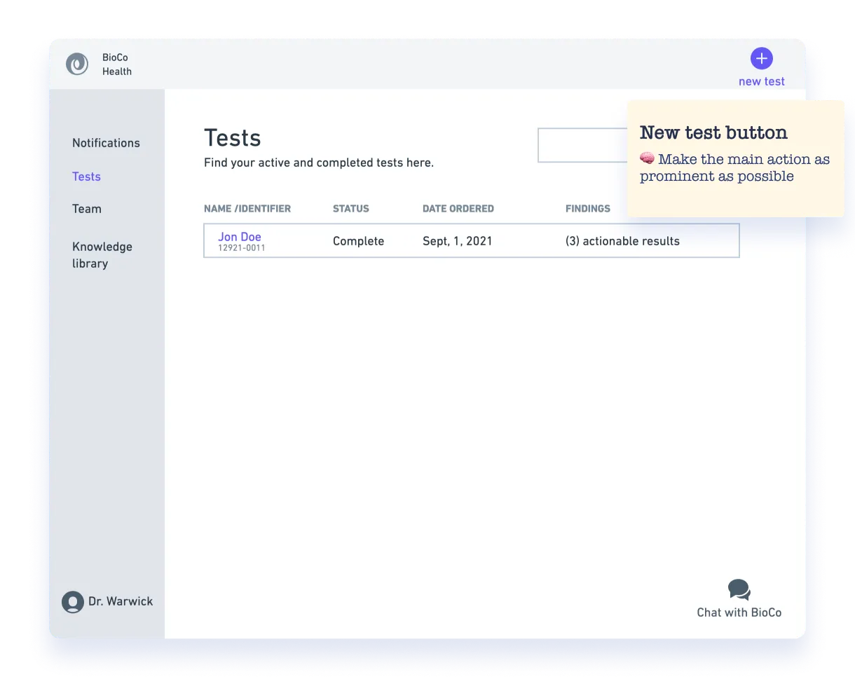
New test button: This is a main action so it is situated in a prominent location. Here, we’re starting to get into some visual/layout rationale but not going fully into it. Oftentimes, wireframes serve as a “note to self” as we increase the visual fidelity. You might mention that something needs to be prominent to remind yourself or your crew during the visual design phase.

Search: It's specified that search is anticipated to be needed and will have to be very noticeable. This rationale makes the case for the existence of the search itself. It’s based on design logic that orients around what people have described in interviews, showing how they work on an electronic medical record software. See how the user logic is right in there? Often we’re leveraging a lot of sources of information and inspiration as we design things. We can’t always have such a direct “user-based” rationale, but it’s a really good way to justify design choices. Note that as you iterate and test, more direct user feedback gets integrated into your rationale.
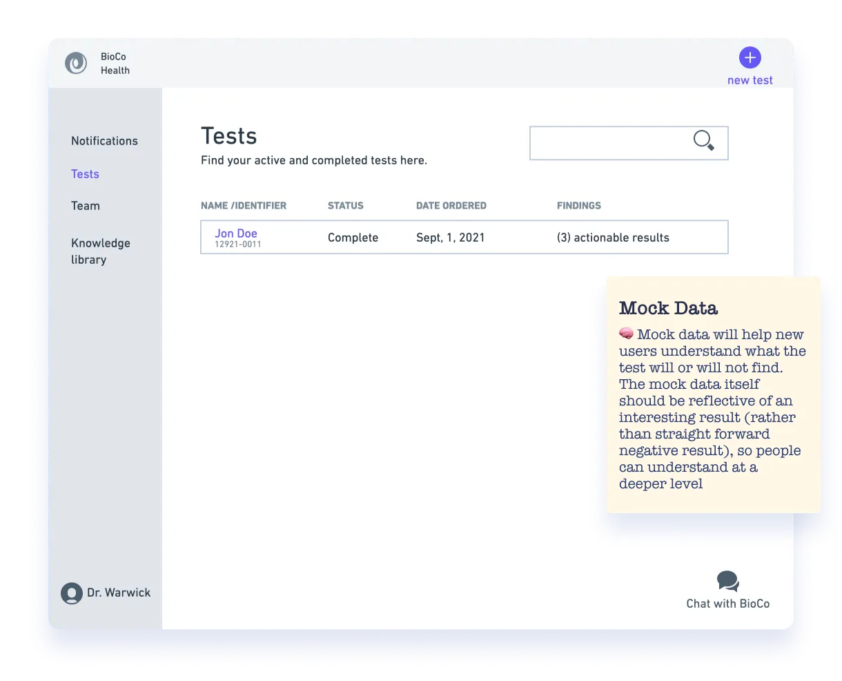
Default state contains mock data: This is a decision intended to address the learnability of the medical test. It aims to address interaction design of the empty state, making it an important part of the design. See how the design choice also shows a very obvious fake name? Notice how the rationale also specifies that the mock data has design requirements too and what the intention is. The designer is anticipating a risk here in how this design is interpreted.
At this point, we are now elevating the level of refinement you’d find on a specific screen. For this example, we don’t lay out all the visual logic and decisions that have been made (though we totally could!). Instead, we focus on just one aspect of the design: the progress indicator.
Going into this, we know that progress indication is important. People are sick and tired of faxing, calling, waiting on hold and reciting 12-digit reference numbers! So some extra design love is put into this part of the design and includes flourishes.
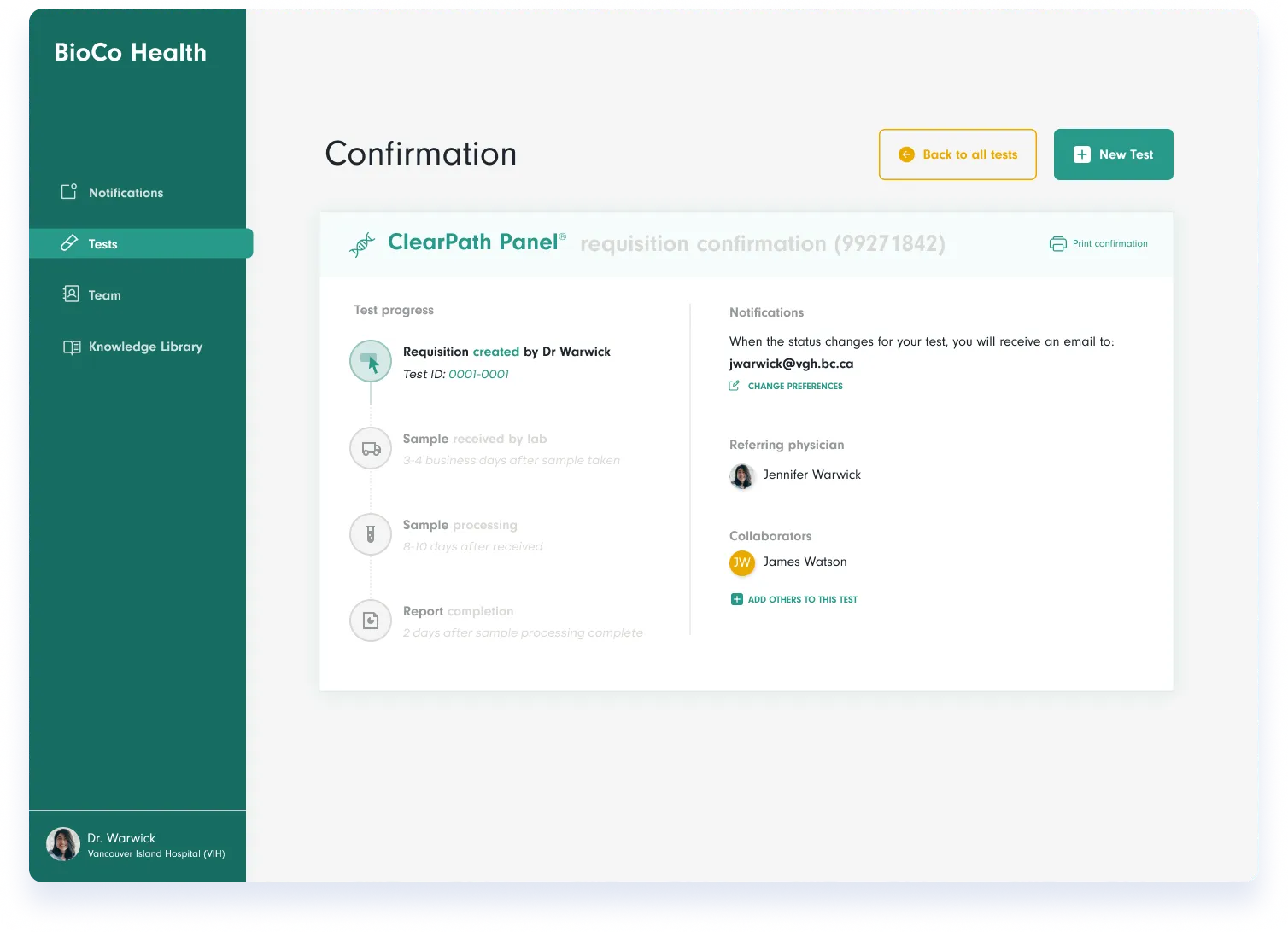
Ok, so the progress indicator doesn't look particularly complicated, right? That’s good, but there have been many choices that have gone into it.
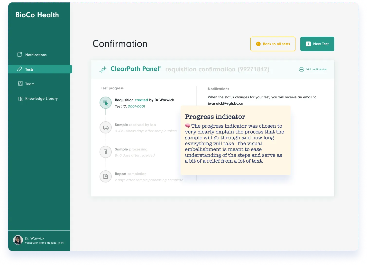
Here, our design rationale focuses on the highest level reasoning about why the indicator is even there in the first place. This may or may not have already been established in lower fidelity, but the way it is explained here really tells the story of why it’s here, what purpose it should serve and also declares its importance.

Progress indicator layout: The rationale goes through the thinking about the layout of the indicator as a vertical one, as opposed to horizontal. The designer makes a practical and stylistic choice here.
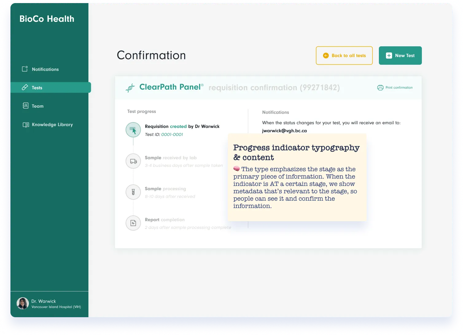
Typography and content: These things are key to whether a design works well or not so well. Here, the designer describes a few things; where the visual hierarchy is and the intention for the content as the system status changes. This would be something that would be brought into more depth in the official design documentation that specifies implementation detail, but here, anyone could understand what would happen with different states.
For higher fidelity work, the visual logic might be something that you address with a more design-oriented crew compared to a less designer-y crowd. Even if your design isn’t getting painfully dissected by a discerning design panel, it’s not a bad idea to go through your visual design choices and document them just for yourself. This type of “journalling” will shed light on the weirdness or the robustness of your thinking.
As a guiding rule, everything you touch with your design fingies should have some kind of rationale associated with it. We firmly believe that it’s a core competency you need to develop and practice nearly every day. In practical terms, how do you do this? How do you capture just enough to remember for yourself and communicate, while not hindering your progress or slowing your workflow down.
If you frame design rationale as the core design decisions plus capturing the evolution of the thinking about a problem, that means that design rationale needs to be captured at many levels of refinement and in different kinds of workflows. Here are some examples of key moments to capture design rationale:
Whether you’re getting into the nitty-gritty details of a task flow for something quite complex, or looking at an overarching “happy path”-type of zoom level, you’re making decisions constantly as you’re going through the process. Sometimes every single arrow and box needs rationale. Sometimes, summarizing the whole flow is more important.
When you’re wireframing, you might be in the concept stage, or have a lot more definition in your mind where you’re looking at screens and the details of them. Either situation warrants a run-through when you’re wrapping up your work session to go through it all and see where you want to leave a paper trail of your rationale.
When you’re working in a higher fidelity context, you’ll need to remember to jot down your rationale. This is when the choices get so micro that you have to be very discerning about what you document and actively keep track of, versus turf into your “archive” page right away.
Have you heard of that trick where when you’re eating a big meal and you sit back and sigh, that probably means you’re full? Maybe there’s something similar here with design rationale documentation. When you sit back and have no more ideas flowing, you return to your work you’ve done in the session, scratch your chin and then document your design rationale. When you feel yourself getting over-full of doubts or unexpressed thoughts, zoom out and write design rationale.
When you feel nicely satisfied, guess what you do? BAM. Design rationale. We don’t suggest interrupting your flow state, but also not getting so tuckered that you have zero energy to solidify your work in proper documentation.
There are a lot of setups and products and general entropy here, but we suggest documentation going as close to the thing you’re building as possible. In whiteboard tools, this takes the form of sticky notes. In Figma, this often takes the form of floating text layers and comments. Other people groom and work a lot in products like Confluence and Notion. Any method is legit if it’s easy for you to do in the moment. Our point is: get a system and stick with it. If the iterations are flying, you may also use voice notes or Loom videos, which is something we do a lot at P&P. You can’t guarantee the team will watch that stuff though, so you need to tailor your approach to the crew and the use cases you think are most important.
Believe it or not, those who sign off on work and sign your paycheque have needs too! Regardless of how the culture works at your organization, to look smart and useful, you need to express yourself well. Too many good ideas go unexplored because they were expressed in a mediocre way and didn’t seem well thought through.
High-level stakeholders, who aren’t totally in the work, need to feel the following feelings:
Wider dev team, those you’re working with medium-close, need to feel:
Immediate working group, those you’re working with super closely, need to feel:
Now, by thinking about your stakeholders this way, it does also open the conversation to thinking about how you present design overall, your design documentation and the UX culture of your org… But there’s no getting around it, we won’t deep dive into all those things here, but it’s important to mention.
An interesting byproduct of design rationale documentation is that it lays bare our decision-making process for all to see, showing us our own patterns. When the reasons behind your core design choices are exposed, it gives us a great retrospective capability.
We want to shoot for balance between the business, design, users and development in a general sense, so when we see decisions start to be heavily skewed towards these different directions, we need to take a moment and figure out our criteria for product decision-making.
“Jerry wants the button to be red”: And Jerry is the CEO or another individual with power but not design expertise. Leaders are meant to set the framework for creation and the vision. This is a tough balance to really hone in on. The product leader needs to take a risk and speak to the vision of the product or product suite. Sometimes, teams don’t really get how to make that vision happen (especially if the team is sans designers), so the product leader might start getting more and more directive. This isn’t an absolute rule that no design suggestions should come from the CEO, it’s more that, if they are always making microdecisions, there’s no design to be done, and you have to hope their instincts are PERFECT, because this creates a lot of risk and dependence on one person.
“Dev team says no”: Again, the flag is only red when ALL of the decisions are made for this one reason. Making product decisions solely on dev constraints becomes a huge bummer. At some point, if design is going to have an impact, decisions need to be made not just out of pace and panic. The dev team might be hyper-adverse to change in this case as well, which doesn’t set up products for great UX success. Taking a design-led approach for at least some features is the only way that you can deliver a great experience to users. The budget might not be there to make smooth transitions and slick animations everywhere, but where it counts, the details should be perfected.
“Because we did it the same way elsewhere”: If you’re working on an enterprise product, chances are you're drowning in tech and design debt. Most products cannot afford to perpetuate their mistakes (though there are also patterns that legitimately work too), so always having this as a go-to might actually be a red flag, not as reassuring as it feels initially. When your right-click menu starts having 12+ items each with their own submenus, using that same approach might actually be perpetuating weird UX. Read Signs of Bad UX for more on the topic.
“I felt like it because it’s cuter that way”: Most of the time, UX design is a bit less like “art direction” because, especially in B2B SaaS products, you’re more rooted in the pragmatic world. What we’re shooting for is a balance between design (style, usability, appeal), product (business opportunity and strategy) and dev (what’s feasible now and later to build). Not skewing all the way over to your “fairy land” fanciful side. Though, in certain contexts, more of this is better. It just can’t all be motivated by a dream you had on a hot summer’s night.
“Competitor does it this way so we copy now”: Yes, there are some things we don’t want or need to reinvent the wheel on, but are you dismissing the possibility of creativity and opting for copying instead of taking hold of a potential opportunity? Chances are, having zero distinction won’t get you a lot of attention out there in the market, or maybe you’re purely competing on price, in which case you probably don’t need a design crew. Again, this is all about balance. When you take these tactics and turn to them too often by default, this laziness can be a detriment to your team and your product.
We certainly snuck in some UX culture themes into this article. Sometimes we just can’t avoid such things, even when you know you should zip it ;).
Welcome to the woo-woo portion of this deep dive into design rationale :). If you’ve read our stuff before, you know we love in-depth writing and we’re kind of obsessed. But this came from a very honest place and is foundational.
Check out this quote our P&P friend said to us recently about writing:
“Dude, since you convinced me to write, my whole thinking has changed. I realized the things that wow I know really well, and the things I think I thought deeply about, but actually don’t have anything smart to say about it.”
Our pal is talking about long form content here, but the principle applies to you as you go through your own journey of creating something tiny for your sprint or something huge, like revamping a piece of software. When you document your rationale, you learn your own mind. You see your thinking as a bit detached from the work, and this can help you find improvements or find confidence in your design choices.
Having the discipline to develop this practice will make you a more self-aware contributor. We know the transformative power of writing, and want you to open your mind about adopting a similar mindset. Writing can be painful at first and make you feel a little silly, but like anything, the ease does come with practice, and the results will make you a better creator and thinker.
In this article, we really got in there! This is a total fave topic for us that we’re obsessed with. You can tell from our looooooooooong articles. Please take what’s useful from this article and show yourself how great you can think about hard problems.
Do a mini UX audit on your table views & find your trouble spots with this free guide.

Be the first to know about our upcoming release!


.webp)


.webp)

