UX Tips For Designing Complex Fintech Products
January 13, 2025

Ceara Crawshaw

Recently at P&P, we were reviewing the industries we work with, and naturally the topic of Fintech user experience came up. Over the past five years, we’ve been consistently designing for fintech and have had the opportunity to work in accounting software, payments, mortgage software and finance-oriented dashboards. Plus, we've gained a first-hand perspective of the finance world by seeking to better understand and visualize our own finances with forecasting and reporting tools.
While Fintech covers a multitude of use cases, we’ve chosen to focus on applications that folks in finance use day in and day out. Because if you're crunching numbers or juggling budgets at work, we think you should be using a software tool that was designed specifically for the tough work you do.
Here’s what we’ve learned so far about designing products for the Fintech world, including the common challenges and our tips to overcome them.
Deeply understanding how finance pros operate in their specific fields is crucial for crafting top-notch experiences, just like it is for any enterprise software.
We focus on UX design for Fintech products that fall into these categories:
So, as we share our tips for Fintech UX design in this article, remember we're intentionally leaving out consumer mobile applications, and focusing on B2B software products, though many of them also have a financial services angle as well.
Fintech UX design is in a league of its own. Sure, all the usual UX rules still apply: you want to steer clear of bad UX, embrace UX best practices, and appreciate the 10 heuristics including consistency, error prevention, and user control and freedom. UX design for Fintech is not much different than design in general but warrant some special considerations
But making excellent professional finance software isn’t just about simplifying at every turn. We need to find that sweet spot where we're showing enough data to be useful but not so much data that the interface becomes inscrutable. We need enough checks in place to prevent people from making mistakes, but we also need enough fluidity to the flow so that finance pros can get stuff done in a fast-paced environment.
Take for example, the famous investment platform Bloomberg Terminal, likely the most in-depth platform in the finance industry. This product costs about 24k per year, comes with its own computer (and keyboard), and allows users to completely customize their views. It’s unlikely that anyone would describe the platform as “pretty,” but what power users appreciate most is the tool’s exceptional customizability and the depth of data it provides.
Not unlike super users in other fields, finance professionals seek information density and the ability to customize their views. Custom setups allow them to get their extremely high-stakes work done efficiently. And the tool’s flexible enterprise software features create a sticky platform that users rely on.
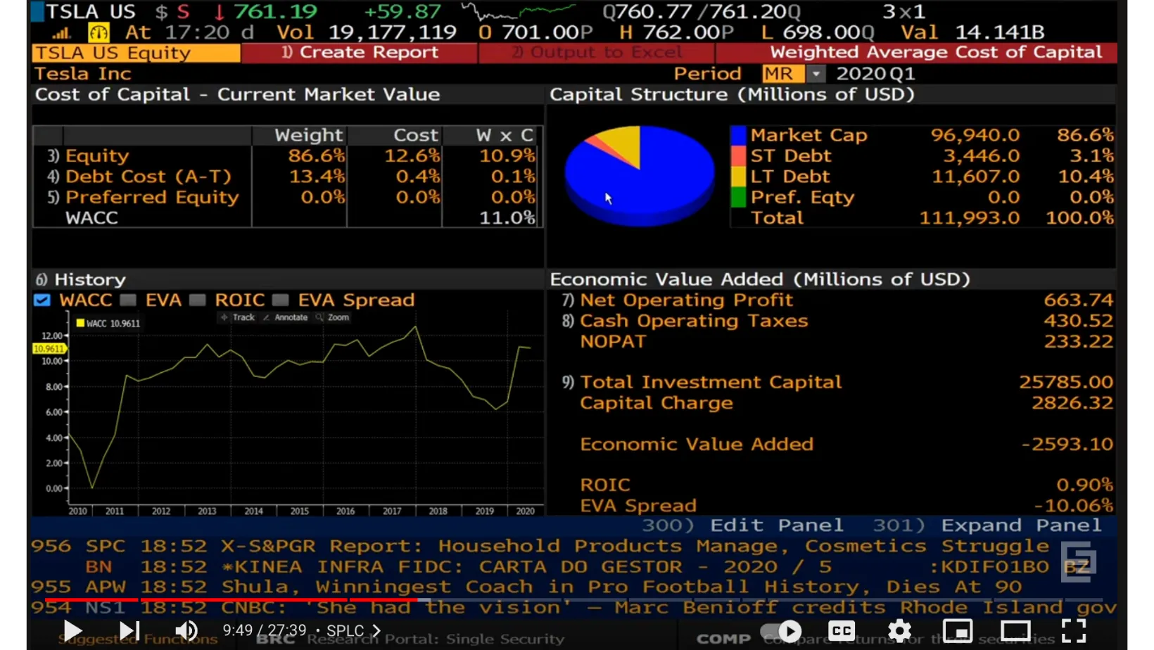
Bloomberg Terminal is a great example of how standard UX thinking doesn’t always fit the complex use cases and data visualization required in these work environments.
Here are some practical ways to give your FinTech product a competitive edge.
When designing enterprise software, our mission is to help people do their jobs better. This means preventing software from getting in the way, slowing down or frustrating users. Fintech design slash user experience is no different.
When it comes to software for finance professionals, every point of confusion or bad usability is amplified (probably by a multiplier only finance professionals could model for us 😂). After all, we’re not just talking about sending $20 to a friend for that Uber ride you split—we're talking about influencing the global economy and the markets that run the world. #kindofabigdeal
The actions and decisions made using these platforms are some of the highest stakes around. That's why we need to design Fintech software with care, incorporating direct feedback from finance professionals on their workflows, concerns, and responsibilities.
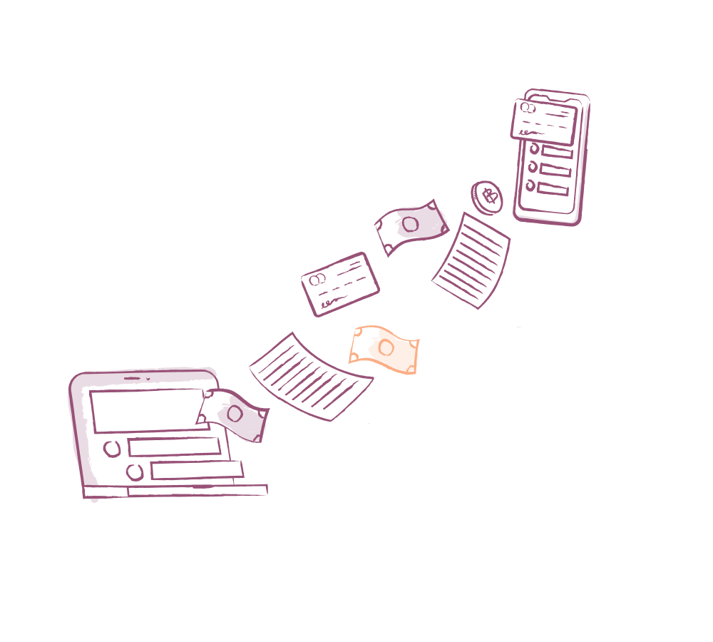
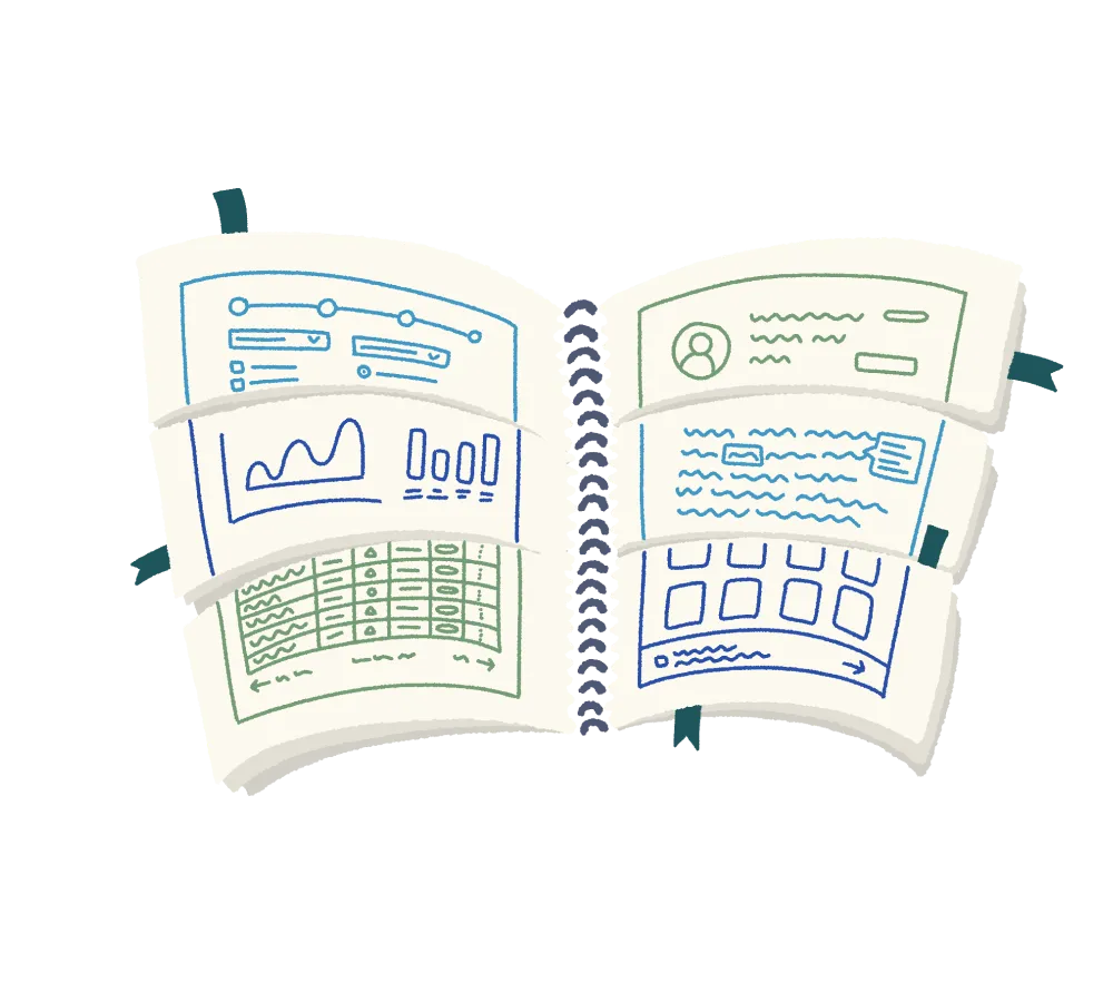
Fintech is all about data visualization. There’s really no way to deal with money without emphasizing this part of the user experience. Despite many concrete dashboard best practices, many Fintech products still fall short of basic usability standards. There are many oddities in finance data, which are typical of most data experiences, but magnified due to the sheer size and speed of these datasets. UX design for FinTech crosses into data visualization in a big way.
Take the element of time, for example. In FinTech, we're not just dealing with trends over a few years; we're analyzing data spanning 100 years, while simultaneously keeping tabs on market changes down to the millisecond. Plus, we often have multiple datasets merging together, each with its own unique time-related quirks.
We've also seen many use cases where multiple layers of data visualizations are needed to give analysts a general vibe of what’s happening over time.
Feature examples that rely on data visualizations:
Some Fintech products are heavily workflow-driven rather than data visualization-driven (although both aspects can coexist). In any high-stakes interaction, we need to set a standard of high-quality interactions within the tool. This ensures that users can understand where they’ve been, what they’ve done, and whether their actions have succeeded or failed (commonly referred to as "system status" in the UX world). UX design for FinTech requires a nuanced view of navigation and workflow.
Feature examples that are workflow-heavy:
In Fintech products, the integration of artificial intelligence (AI) adds a new layer of complexity to the challenges we face in Fintech UX - it's not just a tech trend, it's here to stay. Currently, one of the biggest Fintech UX design challenges in our tech landscape—and likely to persist for the next few years—is the ability to effectively communicate the level of certainty recommendations should be treated with, as well as the constraints of the model within your product.
Feature examples that relate to trust and AI:
FinTech professionals need to trust both the data as well as the system reliability and quality. Building that trust is an ongoing process influenced by several factors. Elements like the product’s look and feel, the copy, and the interactions and product behavior can either boost or erode trust.
Understanding how laws or regulations impact the functionality or logic of your product, as well as its data, is key when creating Fintech UX design and financial services UX design at large.
In the UX process, this entails collaborating closely with subject matter experts in legal and compliance. You want to be able to call upon those professionals for guidance and accurately explain the tech to help them make well-informed decisions.
Feature examples that relate to compliance:
Fintech covers a wide range of software solutions used by professionals globally, spanning areas like payments, lending, investing, and insurance. The stakes are sky high in this industry, and it's crucial to keep that in mind as we work on this type of enterprise software. This is why it's key to make sure that real Fintech UX professionals are in play - we provide specialized UX design services for Fintech where we create elegant solutions that prevent errors, add efficiency, create understanding and ulitmately provide an excellent user experience and help you differentiate in the marketplace. Read about our UX services at a high level and our Fintech UX specialty.
Do a mini UX audit on your table views & find your trouble spots with this free guide.

Be the first to know about our upcoming release!


.webp)


.webp)

