How Do You Design UX for Scientific Instruments When Users Have Variable Training Levels?

June 25, 2026
Ceara Crawshaw

As the business model for instruments shifts to more affordable pricepoints, we find ourselves providing less service and training for scientists to learn how to operate a new instrument. Instead the learning comes in-situ of the core digital experience that run scientific instruments with the secondary mechanism being documentation. Appropriately robust user experience designs (i.e. the design and structure of the GUI) enable this shift when done with the right expertise and knowledge level.

Having honed in expertise in biotech and “insider knowledge” is key to selecting the right design firm to achieve this very consequential work. This is largely because accessing user context can be quite restricted as many scientists working in corporate environments cannot disclose publicly their workflow or work focus whether they are in a clinical or and R&D environment. More open environments like academic labs typically have extreme workloads which aren’t conducive to user interviews and testing. Working with a design team that has worked in these environments and interviewed many scientists throughout many years have inside knowledge that those who haven’t find themselves at a great disadvantage.

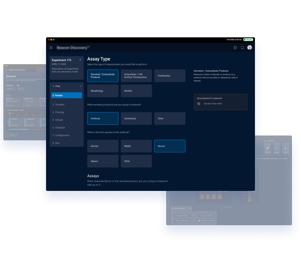
Pencil & Paper has designed many instruments across scientific and engineering scenarios with very consequential stakes involved (ex. giving a diagnosis correctly to a patient) and are well-equipped to translate complex requirements into easy to use UI without stripping out or glossing over the scientific detail that’s relevant.

Principles and Rationale Required

Assumptions to avoid:

  • Don’t assume your user understands your product line entirely
  • Don’t assume your user understands any of your marketing language - including product names or the names of “patented technology” unless your product is widely known and understood
  • Don’t assume your user understands product dependancies - if they set up their experiment to require material that they don’t have in stock
  • Don’t assume your user understands consequences of their choices RE: results, timeline etc.

Design Tactics to Employ - High level

  • Excellent defaults - choose wisely what is reasonable to pre-select for the user
  • Don’t include every choice possible - use progressive disclosure to slowly release options and explain choices
  • Never use AI to generate your GUI - though generative tools are excellent at providing metadata and context, they all deploy the same ideas which will make your interfaces look untrustworthy - experienced designers provide the differentiation you need
  • Always show action/reaction in the user interface to they understand the system is functioning - ex. use loading states in the UI when the system it processing a request
  • Be very explicit if a choice is permanent or has downstream restrictions or effects - your technical constraints or underlying logic needs to be exposed so that users don’t lose significant time and get frustrated by your product
  • Use generative technology only when it is safe and can be audited properly - which needs to be viewable and searchable in your system

Design Tactics to Employ - specific

  • Place your documentation accessible within the experience if possible
  • Make your documentation searchable
  • Whenever possible reduce the difficultly of understanding where the user is (navigation), what state the system is in, and what the consequences of their choices is (downstream dependancies)
  • Use things like inline descriptions, tooltips and clear (non-marketing), language to clearly explain the sections and concepts in the UI
  • Use visual hierarchy to guide the focus and attention around the page (see https://www.pencilandpaper.io/articles/visual-hierarchy-in-ui and pay special attention to the before and after images)

How do you know your UI is effective for variable training levels?

Robust product telemetry is required to understand this at a macro level - every organization and use case needs special consideration, but these are ways we have observed at Pencil & Paper:

  • Flows in the application are completed, not abandoned
  • If you have insight into consumables, you see reordering at an acceptable rate
  • Few recurring support tickets or escalations are hitting your ticketing system

Where good intention and execution differs

Often biotech companies make the mistake to either use their under-resourced internal design team (who don’t have focus and adequate time) or their software developers (who don’t have the skillset or focus) to create the design or do the redesign for the software components of science instruments. This typically leads to broken deadlines and repetition of previous UX mistakes in the new design. Hiring an experienced external firm can be the most efficient on time and the highest design quality, because they have the core design skillset, knowledge of the whole industry and they aren’t stuck in the thinking of the past. This freedom allows for innovation and excellence, depending on the firm you hire.

About the Authors

Pencil & Paper is a key player in designing instrument interfaces having worked with key biotech brands, both large and small. Pencil & Paper is a globally recognized UX studio that sets the standard for enterprise design. They are described by their clients as providing innovative solutions for difficult problems in modern software which provides better user adoption, reduces churn and propels product-lead growth. They routinely innovate on novel experience patterns of generative and AI-driven workflows. They provide fractional design leadership and act as a plug and play design team.

This article was entirely digitally hand crafted by a human being.

Data-rich design, but easier

Our secret methodology for features that hinge on data.

Our Data Mapping Workshop sets you up to design any dashboard, filter, data table or search experience like a total pro, creating better initial designs off the bat and iterating higher quality end results. Stop struggling to understand the material you're working with, take control and make better design!

Data Mapping Workshop

$499 USD
Learn More

Download our Table UX Audit Checklist

Do a mini UX audit on your table views & find your trouble spots with this free guide.

Available in a printable version (pdf).

Please fill in the form below and it will be in your inbox shortly after.
Thank you! Your submission has been received!
Oops! Something went wrong while submitting the form.
letters

Want to dig deeper on flow diagrams?

Be the first to know about our upcoming release!

If you found this intro content useful and find yourself needing to express yourself more efficiently on your software team, this training is for you. Our new flowchart training includes real-life enterprise stories and examples for using flowcharts for UX. You’ll get tips on how to make your diagramming efforts successful, how to derive info for the flow charts, and how to get others to use and participate in the diagramming process.
Thank you! Your submission has been received!
Oops! Something went wrong while submitting the form.
Contact Us

Intro to UX for Teams

A fun, high-impact injection that levels up your entire team and gets UX alignment without all the fluff. We cover everything from the basics of UX to real-life, enterprise examples that you might just sound a little familiar.

For up to 20 team members
7 Videos
55 min
$1000 USD

Explore our UX/UI Services

Curious about the possibility of working with the P&P crew on your enterprise software project? Check out our services.

Our services

Join our newsletter

Bringing enterprise-grade UX resources into the world to help you think better and have more interesting conversations with your crew!

Newsletter sign up

Data Tables Checklist

This free checklist lets you double check your data tables for their UX quality and assess various aspects which make or break the data table experience for your users.

PDF
Free

Data Tables Masterclass

We’ve crafted the masterclass to enrich and expand upon your experience reading our article. Peppering in design principles, more examples and workflow nuances that’ll help you deliver high quality UX.

90 MIN
$149
$99 USD

Curious about our Products for Enterprise software?

Check out what other goodies we have for you and your team

Explore products

Data Tables Checklist

This free checklist lets you double check your data tables for their UX quality and assess various aspects which make or break the data table experience for your users.

PDF
Free

Explore our UX/UI Services

Curious about the possibility of working with the P&P crew on your enterprise software project? Check out our services.

Our services

Join our newsletter

Bringing enterprise-grade UX resources into the world to help you think better and have more interesting conversations with your crew!

Newsletter sign up

Interaction Design Masterclass

Ready to level up with a 1 hour masterclass full of real, enterprise-grade examples?

Check out the Masterclass

Need expert ux help?

Explore your needs and possible solutions in a free, 30 minute session with us.

Book Free Session

Get your free Redesign Assessment Checklist!

We've put together a 14 page PDF with situational questions in a variety of focus areas to help you figure out what kind of needs and solutions you can explore for your software.

Get the Redesign Assement Checklist

Get your Heuristic Report Template Kit

Spend your time and life force actually doing your heuristic evaluation, rather than endless visual fiddling. Complete with a easy to customize Figma file and comprehensive how to videos!

Check out the Heuristic Report Template Kit