UX Teardown: Why UI Automation Tools Are Still Too Hard to Use
April 2, 2026

Ceara Crawshaw

As the world of SaaS tools has grown, so has the realization that not every tool can do everything. In fact, some tools are so specialized they perform just one vital function. For example, Docusign or Hellosign perform the sole function of managing document signatures. Or, say, Calendly which lets you book meetings easily. However, operationally, these tools are part of a process and chained together by people, POCs, CSV exports and all manner of hacks if tools aren’t connected to one another. Take marketing as an example; the activities vary widely; from in-person conference events, to targeted advertising at scale, having a different database of leads and customers gets chaotic and the integrity of your data becomes compromised faster than you can say “Sign up for a free trial”.
Many organizations lack the resources and knowledge around solving issues around data integrity and manual silliness. Hence, automation and integration tools enter the chat.
Zapier, Make and others have been looking to solve this problem by providing mechanisms to integrate and automate processes using a UI instead of code. These products are geared towards non-technical types, but we see some major user experience stinkers throughout these experiences even though their whole thing is making this stuff easier… So why is that? What’s going on?
In this article, we explore the user experience issues and break them down in detail. We’re looking at popular established tools like Zapier and Make as well as newcomers like Skyvern, N8N and automation tools built within Pipedrive.
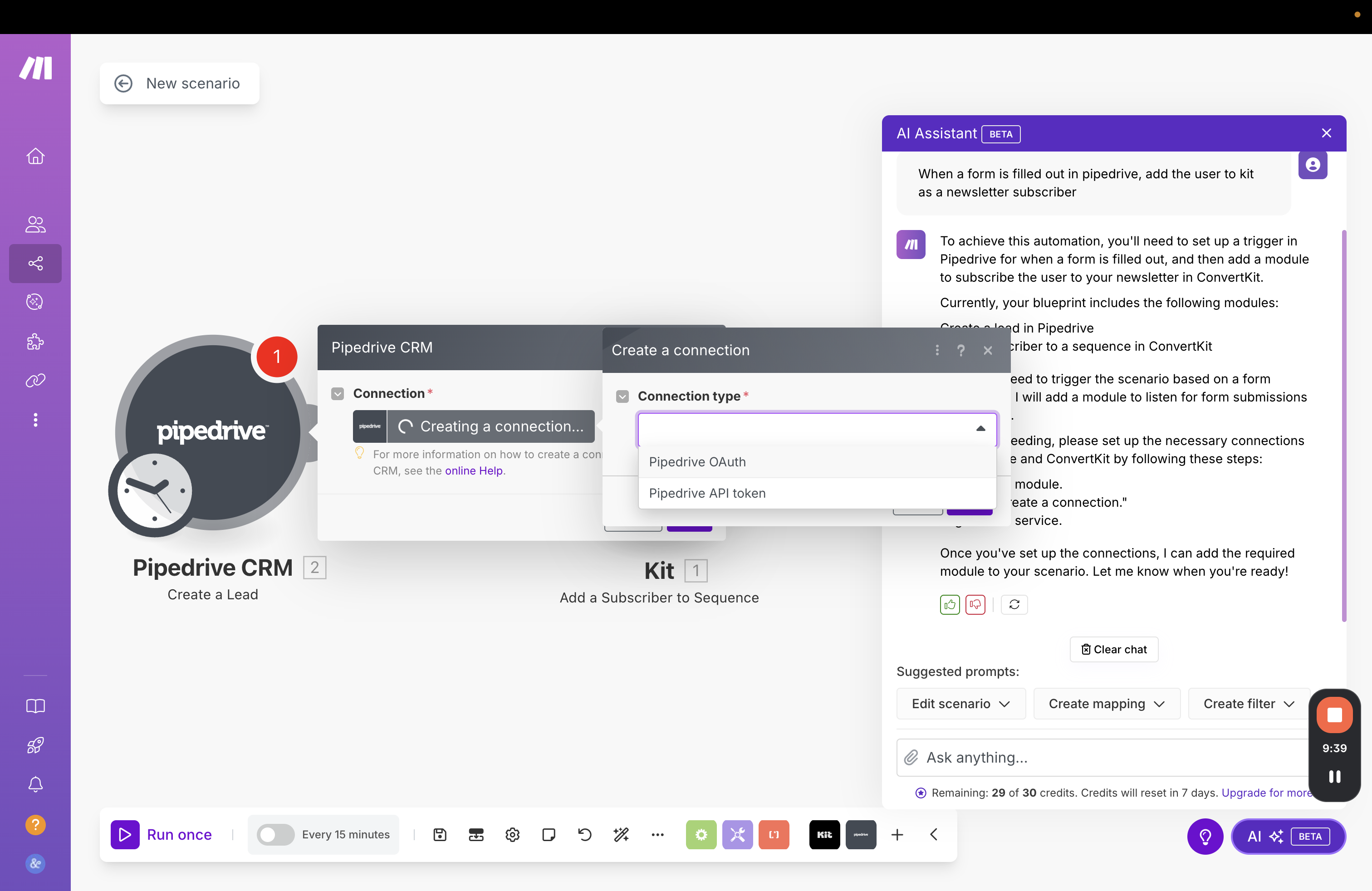
The age old, “worse UX thing ever”: logging in rears its annoying little head in these experiences quite often 👹. As one navigates the workflow creation process, the complexity of logging in or gathering the right credentials for each tool can entirely block the progress of your workflow at unknown moments.
Though the UX of the form shown isn’t “bad”, what’s being asked for precisely isn’t super clear to your less-technical friends.

The login user experience problem is a multi-layered one and one that is deeply engrained with automation tools by virtue of the fact that you need to connect tools together and their permissions and settings will always be implicated in this kind of situation. The UX is as bad as the technical (and organization) complexity in this one.
Additionally, credentials are found in many places, like random text files, brains and password managers. Interestingly, I have yet to see an automation tool that interacts with a password manager effectively… Or that manages a flow to ask an administrator for credentials for that matter either. What’s up with that?

If you have an automation tool or build custom agents and could solve one thing in this UX problem-set, this would be the one. This is a blocker and an extremely familiar one at that. Solving it would be incredibly difficult, but it has the potential to relieve a pain point almost any user on Earth closely relates to and is definitely bothered by. Sometimes winning in UX isn’t making a cute UI, it’s creating the technology that can work around the weird technological constraints that cause so much annoyance.
It’s very difficult for most of us to picture an architecture of what we want and which particular SaaS will be able to deliver it. This is especially complicated in the context of so many overlapping tools. The functionality overlap is real, and assuming that users intimately understand all of the functionality of their software stack is a big problem.

This is a big undertaking to try to describe the behaviour of other products within an external automation builder experience. Personally, even after reading the description, I understand some and not other guidance, but kudos to Zapier for inserting essential context, once you’re inside an experience, but what is a user to do, if they don’t even know where to start? Many products have automation templates to help, but at the core of the UX problem is an important assumption.
Automation tools make a key assumption, that users understand:
Say for example I’m starting to create an integration and the first step is that an external user enters data… Below are all the tools that we currently have or recently have subscriptions to that all from input:
Note that their APIs, pricing models, data models, bugs with each other* are all interacting here in order for me to make my decision on which form to use for my integration. We don’t just factor in whether the form functionality exists somewhere, we always need to factor in layers of weird logic.
*We had an experience in recent memory where Kit forms and Webflow had a bad bug and the styling of Kit forms looked weird, so we had to use another form with fewer issues and integrate to Kit even though they have forms embedded in their product.
Ok, back to my example. So if the first step of my automation is a data input step, I need to decide: of these 8 products, which one can take the data inputs I need? Once I start creating these forms, I will also have to map out what kind of data types can be taken:
To make matters more complex, even if you can identify a good “data input” product for a specific scenario, you might encounter blockers and constraints once the automation flows into the next product, because it lacks the API connection needed.
Automation providers try to help us connect these products together which is an understandable pain point to address, but they rarely help us “do the thinking” about how to create the system their systems can create. Is it asking a lot to get a bit more help here?
Many if not most automation tools start with a trigger, which is a pretty big assumption that people will think like this:
VS
Or even:
There’s a wide gap between knowing a general goal and automatically mapping that (as a first step) to a trigger, before you’ve even mapped out the basics of the automation.

The core of the UX problem here is the idea that we start with (and understand) triggers, rather than the more general idea of the goal and are able to translate the general goal into the specific without much help.
Additionally, not every process worth automating comes from a predictable trigger in a software system. Occasional but tedious tasks, like say, preparing an end-of-quarter report for your website traffic. This is something that may be very tedious and involve logging in and targeting very specific screens across products. It’s perhaps more difficult than a more daily task, where everything is fresher and more familiar to the user. There are few automations that run more like a “tool” that is initiated by a user explicitly.
It often feels in these products that they have copied the design of one another, keeping the assumptions and structure across the products in lieu of a meaningful rethink and redesign of the product.


Wow, we have a new automation, it give’s the marketing team an email blast of all the new leads, including the one’s who filled the contact form in with “goffodlusirurrurjnf”!
The point of automation is not that it brings garbage to your attention as fast as possible, it’s intended to be an operational tool that improves your business systems. In this time we live in, the most valuable commodity is attention and cognitive energy. Preventing the onslaught of information and junk into the minds of knowledge workers allows them to focus and create meaningful work. In order for us to make tools and automations as relevant as possible, we need to take care and consideration here.
Let’s dive into our CRM example, it assumes that a “new lead created” is a big deal and a main moment that you’d want some other stuff to happen, and this is a safe assumption in many ways, but also that “new lead” might be:
➡️ Instead a GOOD new lead would be (that we would want to see urgently):
How do you write this into a typical automation? Even if this was a more “ai-focused” setup, the system would need to understand historical and general world knowledge of who a specific person or company might be. It would need loose and tight criteria on qualification and it would need a mechanism to learn how it’s doing in this assessment. It’s not really an automation’s job to curate your data, but to make an experience good, contextual awareness and clean data is unfortunately pretty important.
UI-based automation tools seem to take the position of: if you translate code into a form it’s suddenly transforms from a scary monster to an approachable, friendly experience automatically.
Unfortunately many experiences make a complicated form and rely on software development mental models to deliver the experience, not explaining or laying out what significance that decision has or what the action means.
So there’s a bit of an odd persona issue here.
On one hand, the UI-oriented interaction model is more suited to a non-technical person on the other hand a “skinned” development experience still requires foundational knowledge and intuition. Intuition that non-technical people don’t have usually.


Many who are exploring automations are not committed to “their process” that’s dialled in and efficient. They are discovering how to make their work smoother and more scaleable. So when someone begins a new automation, they may not have much of a set plan at all. These tools typically assume that there’s an understanding of the thing that’s being automated, when actually there’s a lot more flexibility a person has, increasing the possible options which actually hinders the user experience.
Most of these tools, though ones like Zapier do a pretty good job of making automations discoverable, it still may not be enough, if it’s not personalized to the team and/or has full context of their stack of tools.
Ok, so we have a sense of the wild overlapping functionality between these products (which, by the way is getting worse, according to SaaStr and their trend of “platform and multiproduct”). if you were going to actually make these automation and agent building products better, you would also need the map between the functionality available between all the products themselves and how the team actually uses the functionality in the products. If a system was going to propose an automation structure for you, it runs the risk of still giving you way too many options.
Assuming that there’s no point to automating things unless there’s a systemic trigger that causes it to begin is a BIT of a problem. There are moments where you can’t design a starting point, a button needs to be pressed by an actual human because the circumstances are specific. For example, say you receive documents from a client via email and you need to kick off a sort/organize automation for those files - there’s no predictable variables there, no set email address, timing, etc. It’s also a rare thing, and it’s tedious, which is a great use case for automations. because you forget the process because it’s done rarely, so it requires looking up documentation
Very few automation tools take this into consideration, they assume there’s more system structure than there actually is.
There’s a golden rule in design circles that you start in “low fidelity” by sketching out your ideas really generally then you layer in more and more detail. In many automation tools, they expect that you’re working off “a plan” already. When you may be iterating through a few ways to do an automation to achieve a similar outcome. If you have a specific mapped workflow, getting right into the details makes perfect sense. If you are figuring it out, the feeling of “buy me a drink first” is real. The system is demanding excruciating detail before you may be ready for it.

We would instead draw out a vague outline first, THEN we would layer on the details. In the client scenario, the client may be relaying information they know and we’re recording it, or we are formulating the future state together. So drawing out a vague idea or starter idea isn’t really a thing in automation tools in general.

I recently got 88 email notifications from Zapier about a broken automation. Because these products are all subject to the updates of a gazillion SaaS providers, things are going to break occasionally. There isn’t really a set schedule or methodology across software makers on this front. In fact, they may be disincentivized to integrate well and update their documentation like nice friends.
Ok, so once your integration breaks, that moves data from one system to another —and it’s offline for two days— how do these retroactively get fixed? Well, usually they don’t, that’s a manual task that will need to be done. (Too bad there isn’t a trigger called “My other integration broke”, maybe we could've automated it 🥴).
Now that we have all these separate tools integrating with one another, we create an experience problem where none of the tools are responsible for solving integration issues and bugs and most want to avoid responsibility like the plague.
If we’re pointing to various APIs and doing very “dev” -type things, we have a bit of a problem when issues arise, because if we’re not technical, the root cause to problems will not be immediately apparent.
This is 1000% a bias of our team, but we’re systems people and data nerds of a certain variety. As we create multiple integrations, making different spreadsheets or adding data into different products, unless you have a data architect (which you probably don’t if you’re using these GUI tools), the problem of incoherent and incomplete data is perpetuated and probably increased through automations and agent building.
Your data is stored across so many SaaS products already and probably pulled out and combined in some places and extracted and left to become stale in others. Any leader who has asked “how marketing is going” will probably have a visceral reaction just hearing that question, as marketing is one of the reigning queens of disjointed products. Nowhere does all of your marketing data live. In the end, continuity of your data is important for measuring and scaling a company.
SaaS providers don’t really care about this. So as we examine it, we find that our system architecture doesn’t make sense in the first place and that we’ve been putting a lipstick on a pig.
There’s a difficult line here to walk, where simple automations cross into something else. There’s a line where they tip over into a level of complexity; again the intuition for where this line is won't be clear to a non-technical user. As things seem simple, the true structure and constraints of this universe are not clear. It’s more of a situation of trying very hard to move tedious tasks into automations and tools, but at a certain point, you may find the edge of this and realize you need to switch into custom code. Then you’ll have 78% of your processes in one of these tools and another 22% spread out elsewhere. Yet another approach needs to be taken and maintained. Navigating this as a non-technical founder or someone with a growing company is so difficult, and sadly none of these tools allow you to plan this stuff out at a high-level.
Upon reflecting on all of these experience hiccups, the idea of “fits and starts” really weaves through all of these experiences. There are some moments where you feel supported, others abandoned, interspersed with a lot of readying documentation and switching contexts across applications to get API keys or just try to remember what this or that tool does.
The combination of technical subject matter, organizational complexity and SaaS tool variability make creating “perfect” UX incredibly difficult to do. All of the tools out there are trying somehow to improve the user experience, and are inherently built on the idea that we can enable non-technical people to make moves they couldn’t before, improving their workflows and businesses. That’s really cool. And it’s also very hard. Each company approaching different parts of the problem in different ways.
Do a mini UX audit on your table views & find your trouble spots with this free guide.

Be the first to know about our upcoming release!


.webp)
.webp)

