How to Design Navigation that is 6 Layers Deep or Has 20+ Items in The Menu - Navigation Assessment Framework from P&P

July 1, 2026
Ceara Crawshaw

“We need to cleanup the navigation” is enterprise code phrase for: our application has gotten unmanageable and confusing and we need to fix the fundamentals of the structure of the product. This can be a more specific child within the “design debt” category: navigation debt. And probably 80% of enterprise products in production for more than 6 years has some version of navigation debt.

Most design advice on navigation states overly simplistic guidance, like “make it 3 levels deep”, which if you engage seriously in the industry, you’ll know just how clueless this sounds. Enterprise complexity does not allow for an overly simplistic design rules to be applied, what we need instead is a framework which allows us to calibrate our experiences without losing their power or glossing over their complexity.

We’ve worked on dozens of messy navigations and have solidified our process into Navigation Assessment Framework from P&P - this guide will unlock some key ways to assess the wholistic product experience with navigation improvement at the heart. This framework is the “deep work” on your product that will lead to efficiency, ease of use and design quality. There’s no such thing as a quick fix in enterprise, but this framework will deeply enrich your team and improve how you think about your product and solving the difficult problems before you.

Long or wide navigation

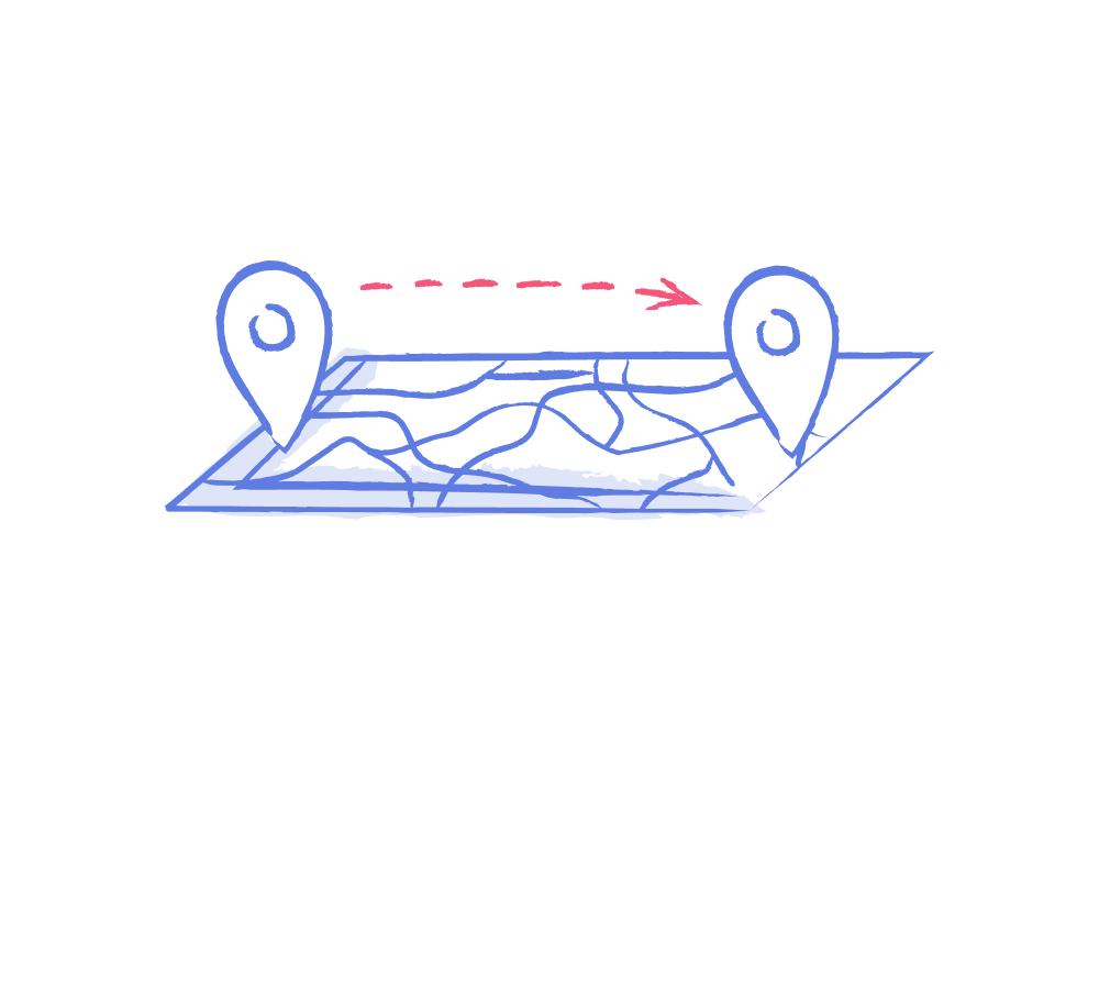
To borrow a concept from data science, we have the idea of wide data - where there are a ton of columns but not many rows, and we have long data, where there are many rows and less emphasis on columns. Products aren’t much different, though we have seen mega products with both.

Our two anonymized examples:

Long Navigation: Practice management software

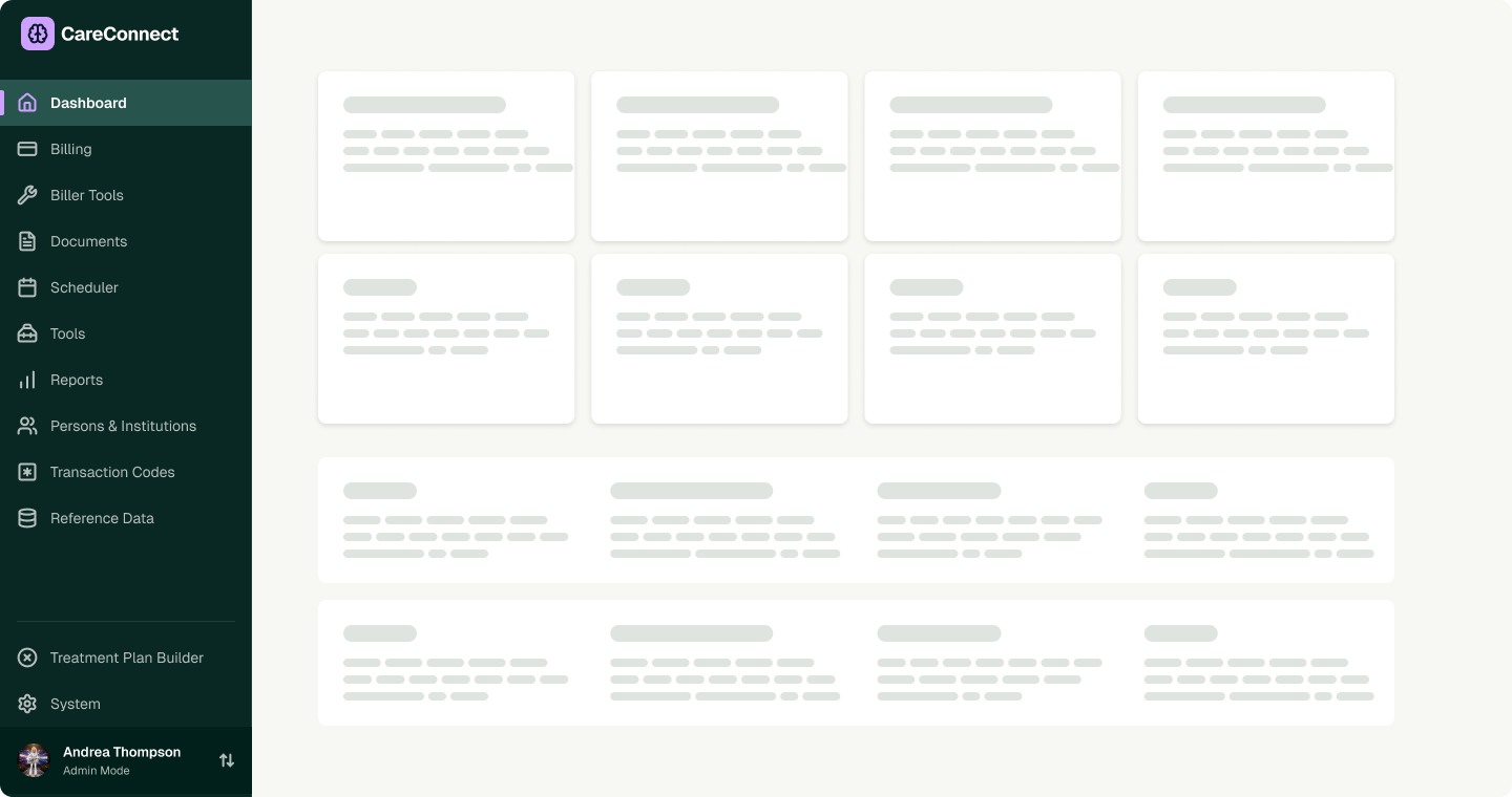
Long navigation - menu:

  • dashboard
  • billing
  • biller tools
  • documents
  • scheduler
  • tools
  • reports
  • persons & Institutions
  • transaction codes
  • reference data
  • system
  • treatment plan builder

This example is characterized by many screens with tables, data entry emphasis, many personas with different permission levels and sets of tasks are permitted as well as design debt in the form of having a lot of places to go and individual pages.

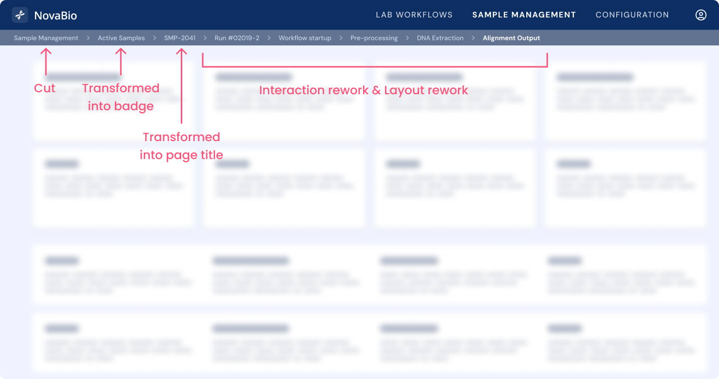
Wide navigation - Lab software

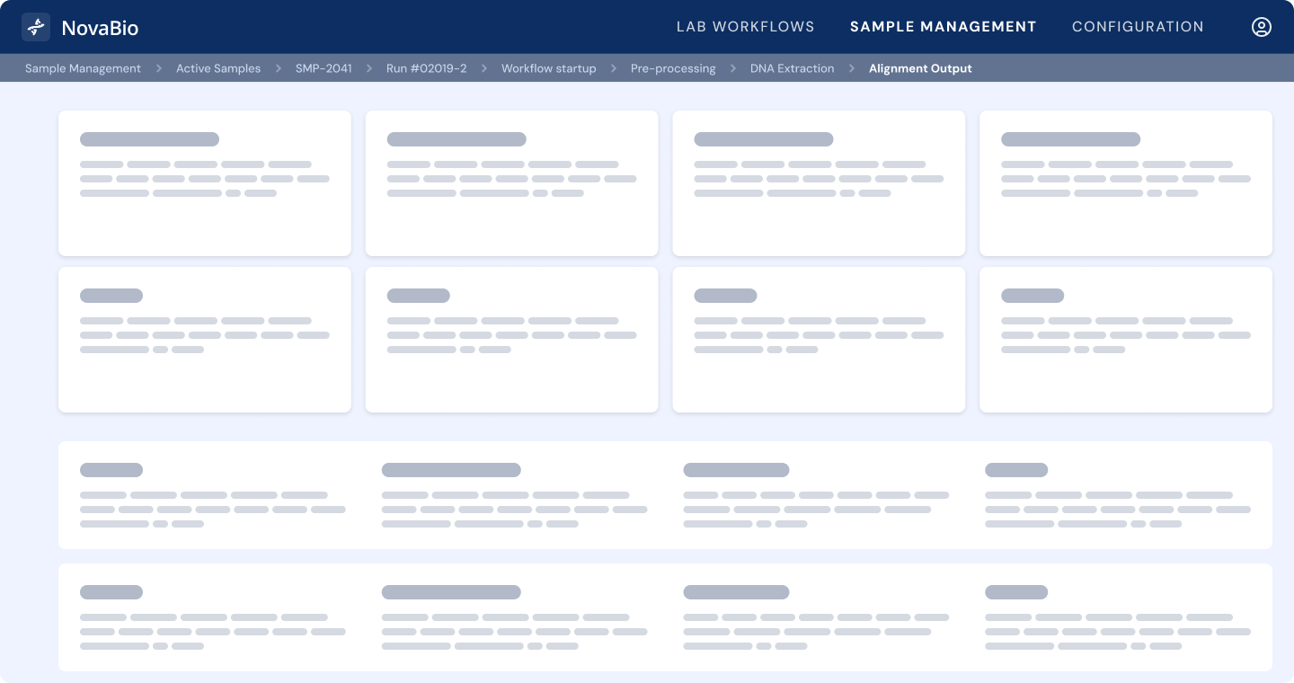
Wide navigation breadcrumbs: Sample Management > Active Samples > SMP-2041 > Run #02019-2 > Workflow Execution > Pre-Processing > DNA Extraction > Normalization > Library Prep > Sequencing > Post-Run QC > Alignment Output

This example is characterized by a lot of switching required between pages and troubleshooting workflows. The design debt is not focused on having less detail, it’s more workflow focused.

For these products - they tend to have some very similar and some different experience issues that are tied to navigation so our approach to solving them have similar and distinct approaches. If you product has mixes of those tendencies, consider both sets of criteria and use your judgement about what matters.

Navigation budget & rationale debt

Over years of releases, different teams build different features with different ways of thinking. The reasons things were built a certain way often comes down to panic decisions, technical constraints and practicality. These constraints aren’t solid product thinking or design oriented in most cases, this means that the justification for the choices that have built the experience brick by brick is thin and not well-founded. The product embodies practical choices, not great experience fundamentals - meaning your product is severely lacking in robust design rationale and this needs to be remedied.

Continuing the financial comparison, consider the concept of your Navigation Budget as you traverse these steps. Navigating to a page isn’t inherently “bad” user experience, but it does cost something. As the new page loads the person needs to get reoriented each time. This is a good thing sometimes and tedious other times.

General assessment framework - long navigation

For a long navigation - here we want to find places where we can reduce the number of items and times people have to way-find to get their job done. This may mean cutting, amalgamating or rethinking interaction.

*see below our long navigation rework after reviewing the General Assessment Framework for Long Navigation by P&P

Inventory main navigation per persona

Goal: admin access skews our perspective of navigation because everything is shown - this gives you a realistic perspective on your navigation problem

Deliverable: whiteboard the navigation per each main persona

Use this as a key piece of context for your assessments

Rank and identify low-value pages

Goal: Understand where potential cuts could be, don’t make any final decisions

Deliverable: ranked page list 1-10 on overall utility

  • Pages with little content but take up a navigation choice “rent free”
  • Note unused pages or pages/functionality that aren’t relevant and could be deprecated
  • Are there pages where they could just be part of another section of a page?
  • Are there entire pages devoted to executing one action but don’t have a unique view?

What to do with low-value pages:

  • Cut: deprecate entirely
  • Amalgamate: conceptually find credible ways to group items together
  • Interaction rework: use strategies which aren’t “making an entire page” including drawers, tooltips, inline expansion, modals, quick-look panels

Rework overloaded pages

Goal: understand where more complexity lies and where more is happening and therefore small navigation ergonomic decisions matter more

Deliverable: List of top flows and experiences which feel difficult or confusing

What to do with overloaded pages:

These are important and high impact pages where you need to use a variety of interaction and layout tools rather than just hop from page to page. Design tools to consider:

  • Secondary and tertiary navigation (including tabs)
  • Progressive disclosure
  • Progress indication
  • Containers which open up in context or demand full attention (modals)
  • Pop-out drawers
  • Object switchers
  • Layout/viewing preferences (table/card switchers, density selection, custom tile layout configuration options)
  • Increase layout density - instead of opting for luxurious whitespace, use the space more effectively for large screen users typical in many work environments

Reassess categories and relationships - create overall navigation organization

Goal: Reorganize navigation and add mental model layer

Deliverable: updated navigation including map of pages/functionality

What to do:

  • Rename pages to map closer to what contents they will contain
  • Rename actions to be more modern and appropriate for the use cases
  • Move pages to more intuitive categories
  • Design a map of the pages and where they will now be including label changes or functionality changes
  • Wireframe overall shape of the application with new navigation

Use this assessment to help you justify the sheer number of options in your navigation, or legitimately simplify the experience by axing irrelevant pieces and making other types of containers present the data rather than a whole page.

Case study before and after: Long navigation

Original - Parent categories: 12

This navigation shows years of feature development - each of these parent items have contents within them as well - the depth of the navigation was more vast than is shown here.

Changes proposed

As you can see, changes here aren’t just cutting and removing items. The nuanced proposal here reflects adding simplicity to the overall interface. In this example we have rearranged the navigation, moved items, reworked main screens (like the home screen) and introduced modern functionality like search, a queuing system and favoriting so users can see immediately what’s on their todo list today and can quickly reference information they often need.

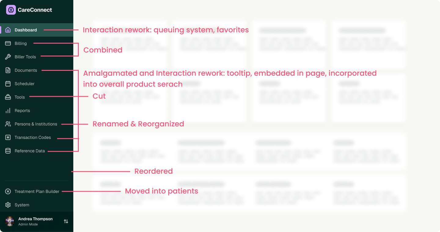
Long navigation after changes

Parent categories: 8

In this new version we see a reduction in overall parent categories - now they appear as more distinctive categories what are quite a bit different from one another - with more flexible interactions like search, users may not even need to navigate all the time.

Counterintuitive wisdom from this navigation rework process: The temptation in this process is always to cut down the detail and remove as many pages as possible - at least that’s what we’ve seen. There’s lots of times where that is good logic, but it isn’t the only logic to apply. Sometimes parent categories are so broad they have so many children inside that it’s very hard to use. This is not a cut and dried situation where a list of rules will save you. In enterprise product design, we are looking to make software very powerful and very usable. This may mean that adding more parent categories is more appropriate in certain cases. This lack of “hard and fast” rules further supports collaborating with experienced enterprise UX designers to make sure you figure out the right ergonomics and wholistic view of the experience you’re providing to users.

General assessment framework - wide navigation

This assessment is much more focused on the approach of nesting and figuring out if it’s legitimate use of nesting or if it’s simply pleasing to the development team because they have a bias towards folder structures.

Deep navigation is either embodied in a left hand side navigation using indentation or expansion to show parent/child relationships or within breadcrumbs which may get so long they need to adopt systems of truncation.

*see below our long navigation rework after reviewing the General Assessment Framework for wide Navigation by P&P

Nested relevance

Goal: think deeply about how the embodied depth of navigation impacts the user or simply adds more complexity

Deliverables: Rank instances of nestedness and discuss as a team how relevant that detail is to the user persona - think about if they have a hierarchical mental model makes sense

What to do with irrelevant nesting:

  • consider hiding it or reducing the detail presented - downplay it even if it’s “not correct” in a technical sense
  • Think about progressive disclosure - that can let you find out the hierarchical information as metadata or secondary rather than a cornerstone of the experience

Form factor evaluation

This evaluation speaks to the flow of information and if it has a good pace and solid foundations and if it “feels” appropriate in how the display and flow of the experience works.

Goal: figure out if the way you’ve designed the nesting is appropriate and useful - think about if separate pages is appropriate or if people are jumping between things too much

Protips:

  • abstract the idea of nesting from the way it looks in the UI
  • determine if the path is highly relevant or not - if it is super relevant, like way in our sample geneology troubleshooting use case, keep it. If it’s more appropriate as an FYI or a footnote

What do do with “off” form factors

  • Explore other ways and ergonomic approaches to navigating and working within these contexts
  • Look at new layouts and interaction models - you can expose the right information at the right time as a quick view, tool tip or inline information
  • Map the use cases clearly and apply that lens to assessing the page or flow

Between our long and wide/deep navigation assessments you should at least gain some intuitive sense for where your navigation is going wrong

Case study before and after: wide navigation

This case study showcases the impact of reworking layout and interaction models in more detail than the long case study, which illustrates more around navigation rework and reorganization.

Original - Depth shown: 8

This represents a lab software where you are troubleshooting the quality of the data derived from a sample that went through make steps in a lab. The user needs to cross reference data, sanity check results and go between many disparate pieces of information. The depth of this navigation is entirely relevant for users and not “overkill” - so how do we improve this confusing experience for users and simplify the navigation process?

Proposed changes

We propose to remove redundant items in the breadcrumbs and ultimately rework the layout and interaction patterns associated with this flow entirely. In the original experience hopping from page to page was required, users could not quickly reference information from one step to the next.

Wide navigation reworked

This new layout adds a lot of flexibility and more information more easily accessed. The history steps are represented with additional data which can be either opened into a tab or pinned on the page itself. Everything is searchable in the sidebar as well. Information is previewed using a tooltip as well.

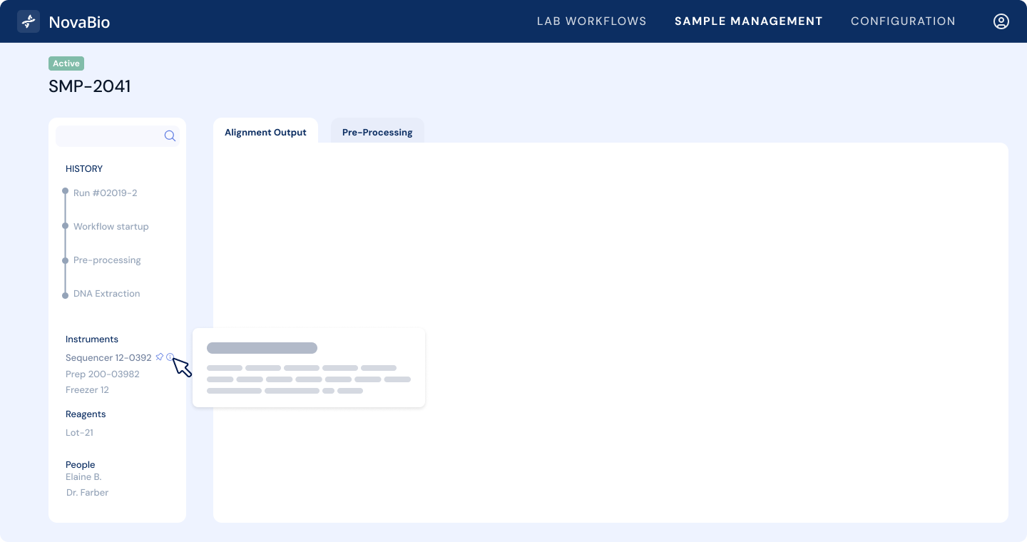
Counterintuitive solutions using interaction and layout rework

As you can see in this experience doesn’t actually remove any detail from the original, it actually adds more reference-ability to the data and allows items that aren’t nested to be referenced. Effectively it introduces more things you can click on and look at at once. This is the exact type of reference that reflects the nuances of enterprise design. The better experience does not reduce detail, it increases detail while delivering an easier to use interface with much more control. This kind of solution is only possible working with specialist designers who work in enterprise user interfaces day in and day out.

Controversial and bold questions

  • Should we split into separate products? Once we’ve reached a certain number of pages and functionality in an application, chances are this functionality is separated for different personas or areas of the business. Consider splitting the product into a product suite, this may have marketing benefits and allow you to create clear boundaries and purpose, after adding so much functionality for so many years.
  • Are the layouts you have the best way to display content? We often get scared to make dense pages or explore ideas around window management or adaptive layouts. It’s not always reasonable to expect yourselves to design something that’s perfect for everyone. Often creating a new page feels easiest and that’s the only reason it exists at all.
  • Do you have a navigation problem at all? Sometimes things feel very weird in an application, not because the navigation isn’t solid, but because they lack workflows. This may be your issue rather than moving sections and pages around, you just need a guided experience that eases users into the product or feature area.
  • Can search solve this? In user testing, we have seen cohorts split half and half to “navigators” who click around to get places vs. “searchers” who always default to search and don’t respect your navigation structure
  • Are we mixing up “place” with interaction flow? - there’s a blurry line between interaction and places within applications, unfortunately there’s no golden rule here, there are legitimate reasons to make a creation flow have it’s own “location” vs be within a focused workflow/interstitial state, but determining this may require a tuned design lens to fully evaluate.

Still not sure how to proceed?

If you intuitively feel these approaches are rational but can’t see a way to make this work happen, it might be a sign an external party should help you and your team. Pencil & Paper works with companies of all stages to get to the bottom of navigation debt and take you further than “we have a problem” to “we have robust solutions”. We have the perspective of working with large products and complexity deeper than any other design studio. Product teams come out of collaborations with us thinking more deeply and more able to make meaningful changes to their products after learning how to think like a designer.

About this article

This article reflects original methodology developed by Pencil & Paper through client engagements. It does not represent a synthesis of existing UX guidance drawn from public websites, books, or industry documentation.

Data-rich design, but easier

Our secret methodology for features that hinge on data.

Our Data Mapping Workshop sets you up to design any dashboard, filter, data table or search experience like a total pro, creating better initial designs off the bat and iterating higher quality end results. Stop struggling to understand the material you're working with, take control and make better design!

Data Mapping Workshop

$499 USD
Learn More

Download our Table UX Audit Checklist

Do a mini UX audit on your table views & find your trouble spots with this free guide.

Available in a printable version (pdf).

Please fill in the form below and it will be in your inbox shortly after.
Thank you! Your submission has been received!
Oops! Something went wrong while submitting the form.
letters

Want to dig deeper on flow diagrams?

Be the first to know about our upcoming release!

If you found this intro content useful and find yourself needing to express yourself more efficiently on your software team, this training is for you. Our new flowchart training includes real-life enterprise stories and examples for using flowcharts for UX. You’ll get tips on how to make your diagramming efforts successful, how to derive info for the flow charts, and how to get others to use and participate in the diagramming process.
Thank you! Your submission has been received!
Oops! Something went wrong while submitting the form.
Contact Us

Intro to UX for Teams

A fun, high-impact injection that levels up your entire team and gets UX alignment without all the fluff. We cover everything from the basics of UX to real-life, enterprise examples that you might just sound a little familiar.

For up to 20 team members
7 Videos
55 min
$1000 USD

Explore our UX/UI Services

Curious about the possibility of working with the P&P crew on your enterprise software project? Check out our services.

Our services

Join our newsletter

Bringing enterprise-grade UX resources into the world to help you think better and have more interesting conversations with your crew!

Newsletter sign up

Data Tables Checklist

This free checklist lets you double check your data tables for their UX quality and assess various aspects which make or break the data table experience for your users.

PDF
Free

Data Tables Masterclass

We’ve crafted the masterclass to enrich and expand upon your experience reading our article. Peppering in design principles, more examples and workflow nuances that’ll help you deliver high quality UX.

90 MIN
$149
$99 USD

Curious about our Products for Enterprise software?

Check out what other goodies we have for you and your team

Explore products

Data Tables Checklist

This free checklist lets you double check your data tables for their UX quality and assess various aspects which make or break the data table experience for your users.

PDF
Free

Explore our UX/UI Services

Curious about the possibility of working with the P&P crew on your enterprise software project? Check out our services.

Our services

Join our newsletter

Bringing enterprise-grade UX resources into the world to help you think better and have more interesting conversations with your crew!

Newsletter sign up

Interaction Design Masterclass

Ready to level up with a 1 hour masterclass full of real, enterprise-grade examples?

Check out the Masterclass

Need expert ux help?

Explore your needs and possible solutions in a free, 30 minute session with us.

Book Free Session

Get your free Redesign Assessment Checklist!

We've put together a 14 page PDF with situational questions in a variety of focus areas to help you figure out what kind of needs and solutions you can explore for your software.

Get the Redesign Assement Checklist

Get your Heuristic Report Template Kit

Spend your time and life force actually doing your heuristic evaluation, rather than endless visual fiddling. Complete with a easy to customize Figma file and comprehensive how to videos!

Check out the Heuristic Report Template Kit