Dashboard design challenges
Signs you need our help
Whether you’re looking to eliminate bad UX or enhance your UX culture, we’ve got you sorted.

Designing realistic and user-centric data viewing, exploration and transformation experiences for lay people and data professionals

Whether you’re looking to eliminate bad UX or enhance your UX culture, we’ve got you sorted.


We believe data is beautiful and that it’s wildly underused in organizations because it hasn’t been properly designed for the people using it. Dashboard design has historically been done by those few who know the data really well, meaning that most dashboards aren’t fit for the persona(s) using them. They often lack an intuitive order and composition that would be accessible to someone who isn’t an expert. Our mission as enterprise software UXers is to empower people at work through great software UX.
If more people can use data effectively as part of their workflow, we can reduce churning on basic problems, making decisions blindly and elevate the level of problem solving we can do.
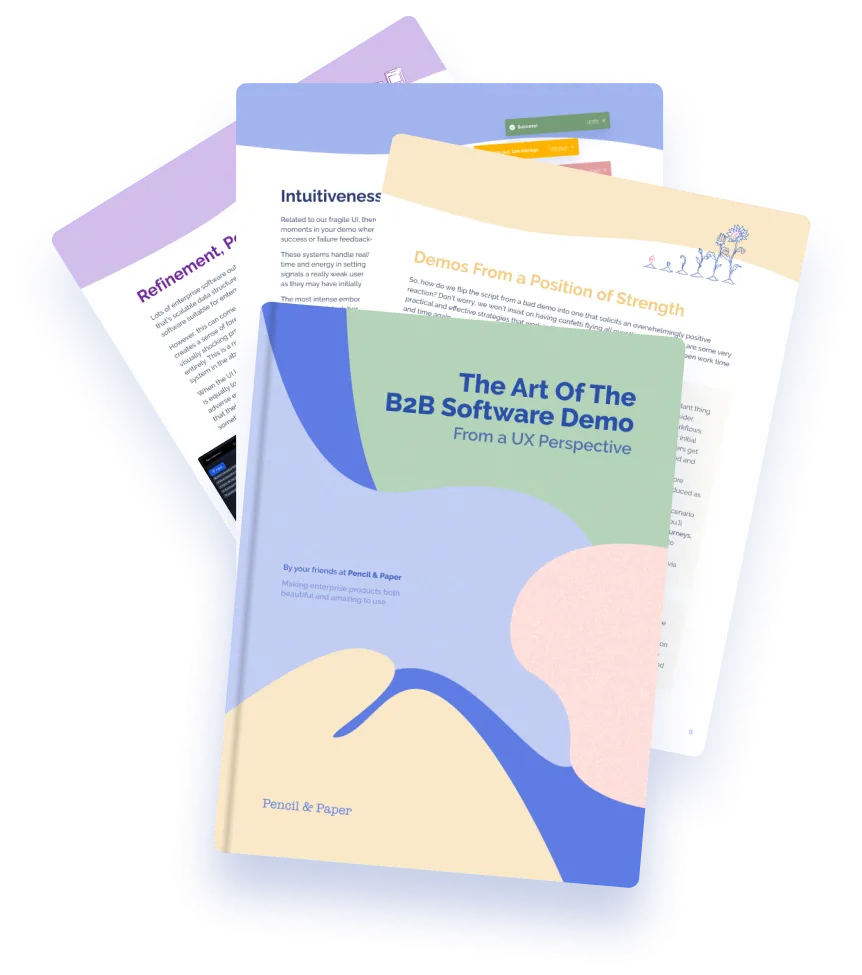
Applying the right design principles to your demo can create excitement and engage your audiences more effectively. We put together this whitepaper to help you inject some UX love into your product—we cover common mistakes, what a makes a demo successful, and more!

Dashboard design is no joke, you need to know you’re working with the crew that can get it done.
We have processes in place which modify the typical UX design process and allow us to gather relevant information and start diving deep. One such process is our “data context mapping” workshop, where we derive the data details from your data SME, learning the structure, quirks, size, and nature of the underlying data. This is part of an onboarding process which lasts typically 2-4 weeks.
If you want to get your ducks in a row ahead of time, you can create a basic data dictionary and task flow for your product or dashboard. This acts as a jumping off point. In addition to that, we need a data expert who has enough bandwidth to answer questions and participate in a few design sessions with us.
There are a rich variety of use cases across enterprise software products. From alert-oriented experiences, to reporting and data exploration. If your product isn’t putting its best foot forward for your users regarding data oriented experiences, you probably need some design help from the P&P crew.
P&P has a collaborative culture which is based in creativity, pragmatism and efficiency. We work on data projects with the usual crew: product managers and devs but also a data expert like a data analyst, scientist or architect.
We use high-fidelity tools like Figma to mock up ideas, interactions and behaviour. We also work with devs on client teams to prototype using real data. If you’re setup to prototype in code that’s great! If not we can still do great work.
We act as a plug and play design team for a range of situations. From teams who have never integrated any kind of UX design resource, to supplementing and collaborating with existing design teams. Depending on your needs, we can take the lead on new ideas, or support the team you have in place. We shine when it comes to collaboration and integrating quickly in teams. See our article about Product Management and Design Collaboration for example.
We do the full scope of UX/UI design for software in the enterprise arena. This includes “zooming out” and formulating logic around the whole flow, to wireframing (mapping out screens) and producing realistic prototypes. UX/UI design however does not extend to branding or marketing, so we will happily refer you to wonderful teams we know.
